

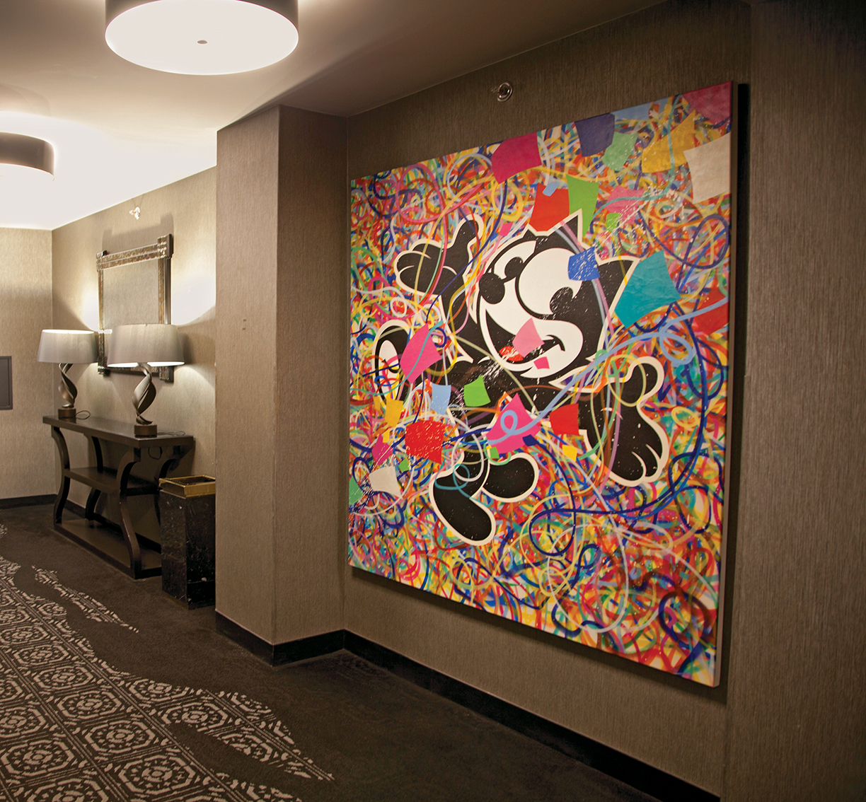
Photo by Rick Chaffiotte Photography.
Interior Designer Marissa Stokes aims for designs that are classic and timeless. And says don’t overlook the ceiling.
For designer Marissa Stokes, home has been a variety of places. Home was growing up in New Jersey, where creative parents and a need for change led to an intense love for interior design at a young age. Home was also New York, where she earned a degree from Parsons School of Design and worked her first jobs at elite design firms, including David Kleinberg Design Associates, Victoria Hagan Interiors and Jayne Design Studio. And now as an accomplished designer, home is more than just a place — it’s every threshold she passes, every piece of furniture she chooses, every decision she makes in order to help craft the perfect space for her clients. We spoke with Stokes about her experiences in the industry and how her love of interior design has transformed her career so far.
How do you think living in New York affected your design style and preferences?
You’re just exposed to so many amazing things, being in and around New York City. The architecture alone, having incredible museums at your fingertips. I also went to school in NYC; I think that was an incredible experience, but also had a huge influence on my design aesthetic, just having everything at your fingertips, between different cultures, food, architecture. I feel fortunate to have lived there and so close to there still now. I love New York City.
When was the first time that you ever thought about working in design?
I really have always wanted to be an interior designer from a very young age.… I think it’s because my parents are both very creative people, always doing things to improve our home.… My dad made furniture, we even had a woodshop in our basement. I just had this love for transforming spaces and the process, and I just fell into it very naturally.
Did you learn wood craftsmanship yourself?
Yes! I had all the tools at my fingertips in the shop, and I am still able to use them now, a bandsaw, a tablesaw, et cetera. We also had a sewing machine, so I grew up sewing at a young age — we’d be making window treatments and pillows. I was always transforming my personal space, shifting things around, changing them or painting them. Making them look different. It was just something I always loved to do, and still love it.
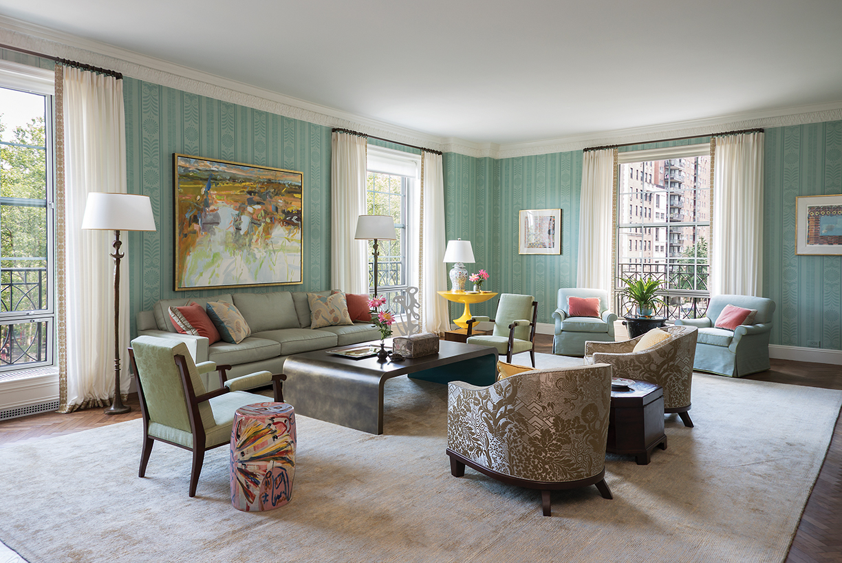
A bright living room situated in an Upper East Side apartment.
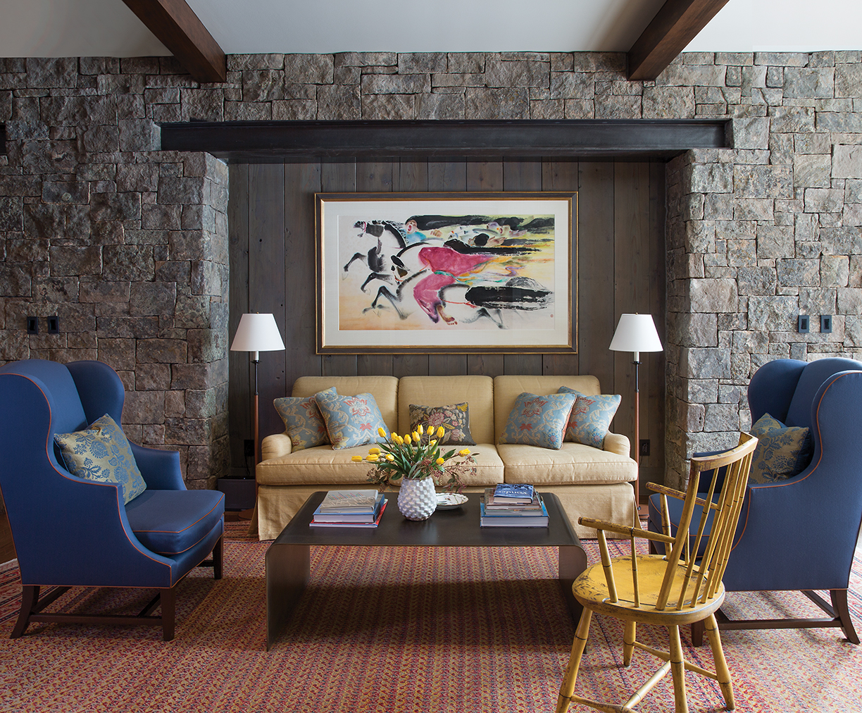
The corner of a library in a Montana lodge.
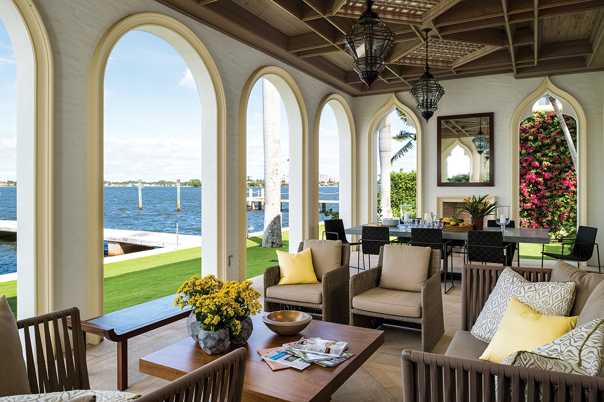
A Mediterranean Revival home on the Intracoastal in Palm Beach.
Above photos courtesy of Jayne Design Studio.
Why do you do what you do, what about art and design draws you into doing it every day?
I love making people’s dreams come true. There’s something so rewarding about helping a client transform their space so it’s not only functional, but beautiful. In terms of art and design, there’s so many artists and creatives out there who are doing incredible work, and I’m being exposed to them, just learning and growing. It’s another reason why I love what I do. Every day is different and I just love that.
Are there any activities outside of work that help inspire you or your work?
Outside of work, I’m always trying to get out in nature, go for a walk or hike — nature is always inspiring. I feel like I can always pull things from that. I love to travel as well, even though it’s been a bit difficult to do so.
Where’s somewhere you love or would love to go?
My dream place I’d love to go is Greece. It really offers everything. It has ancient and historical sights, of course, but also beautiful landscapes and amazing food.
What has been your favorite project to do?
I worked on a project for Jayne Design Studio in Palm Beach. It was my first project as a senior designer for the firm. It’s a Venetian-inspired home on the Intracoastal. The clients were art collectors who wanted to enjoy the views and display their art. We designed and decorated a home that was quiet, clean and sophisticated to balance their collection and the architecture. I loved the home, its location and the clients. I will always have a soft spot for it.
When it comes to designing, what is the most important element you have to remember?
Well one thing that tends to be overlooked, I think, is the ceiling. It’s very important to design from top to bottom, to think about ceiling work, a lighting plan, and overall how it’s treated and how it affects the space.
Is there a piece of art in your own home that you would never consider selling?
Everything is here for a reason, so not one specific piece.
It’s always important to surround yourself with things you love, even if it’s a bit eclectic, surround yourself with furniture and art that you love. When you do that, things just kind of work together. There’s no standard.
What do you want people to take away when they look at your work?
I want people to find it classic and timeless, something that could last forever. I don’t want someone to walk into a space and instantly date it. I want the clients to be comfortable in their home for a long time. Keep things sophisticated.
What advice would you give to someone going into design?
Don’t be afraid to roll up your sleeves, you have to wear a lot of hats in this industry. Maybe start with an internship, but, all in all, do whatever you need to do to learn.
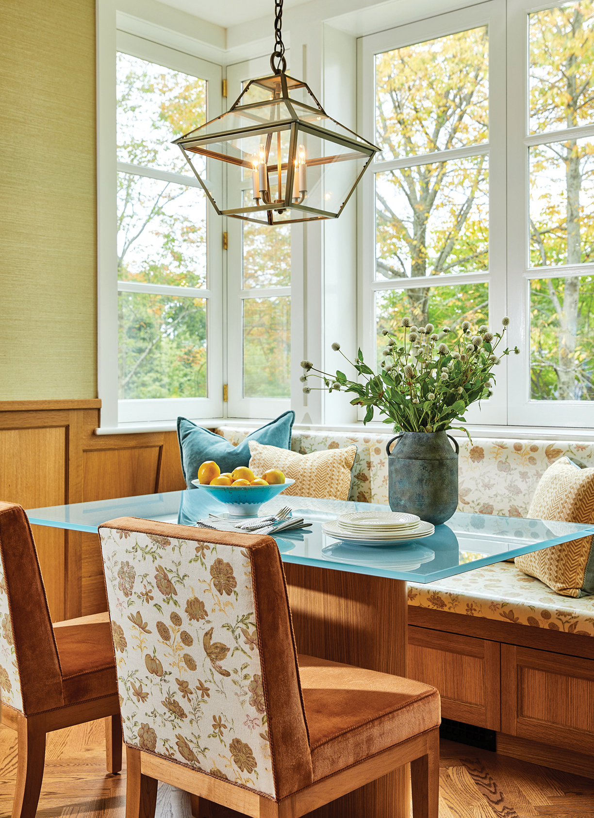
At left: A cozy breakfast room nook with a custom-designed banquette. Photo by Aaron Thompson.
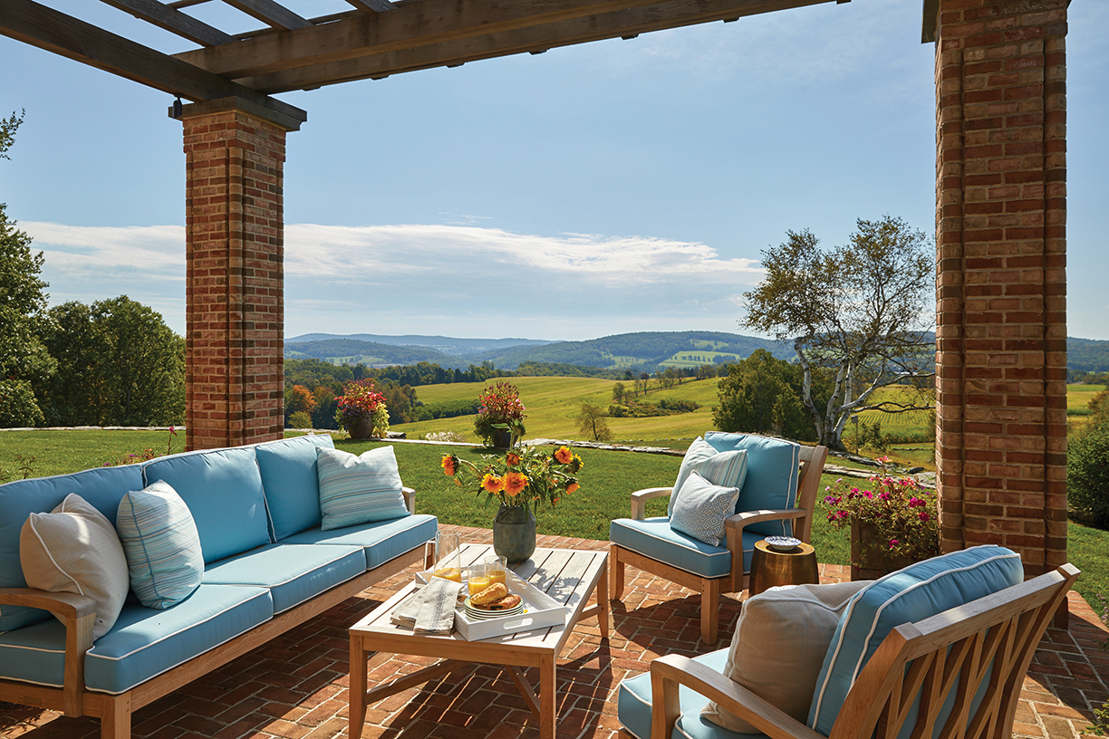
Above: An outdoor terrace overlooks Dutchess County. Photo by Aaron Thompson.
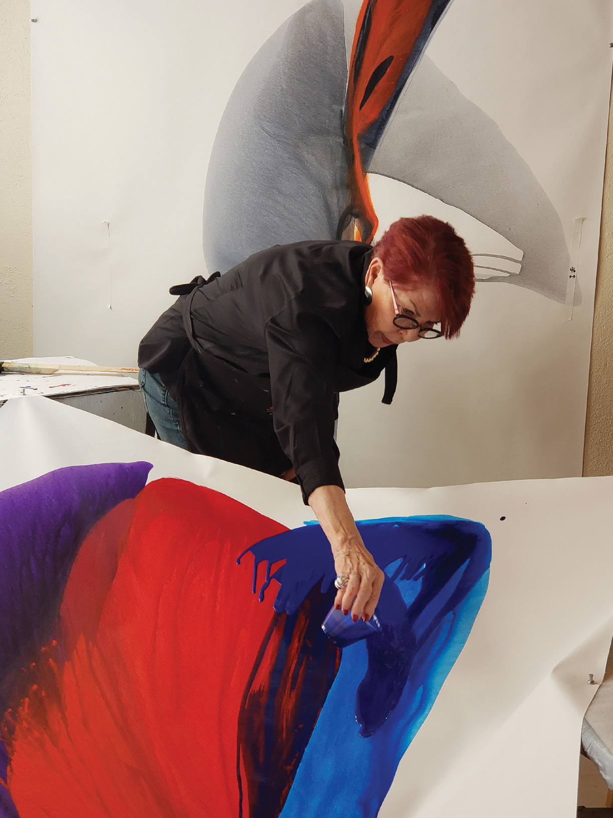
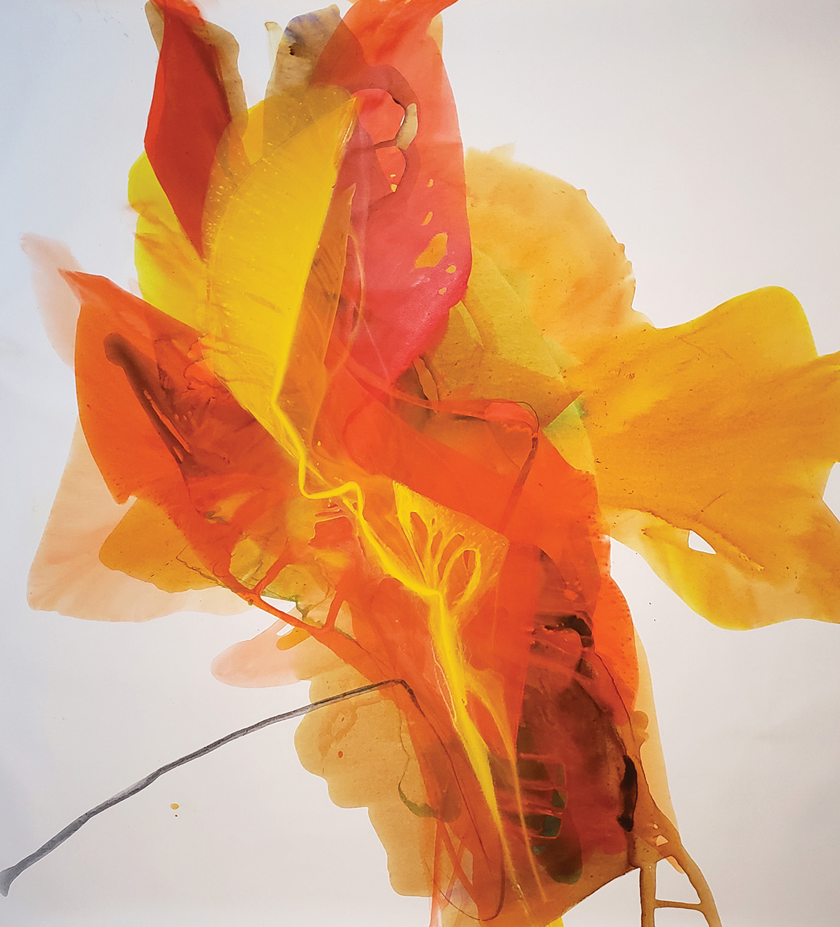
Bette Ridgeway creates magic. She pours her heart and soul into the artwork that she creates. When the American abstract artist felt the rush of loneliness during the COVID-19 lockdown in her Santa Fe, New Mexico home, she turned that feeling into a work of art. With tones of grey, blue-grey, and white, Ridgeway let the paint (and gravity) speak for itself. She stepped back and knew that the name of the painting was Loneliness.
Ridgeway doesn’t use any paint brushes. Her canvases don’t sit atop an easel. Instead, she uses acrylic paint, a canvas, stools and plastic cups. The rest, she leaves to gravity.
“I call the technique ‘pouring’ and use the phrase, which I copyrighted, ‘layering light,’” Ridgeway explains.
Bette Ridgeway
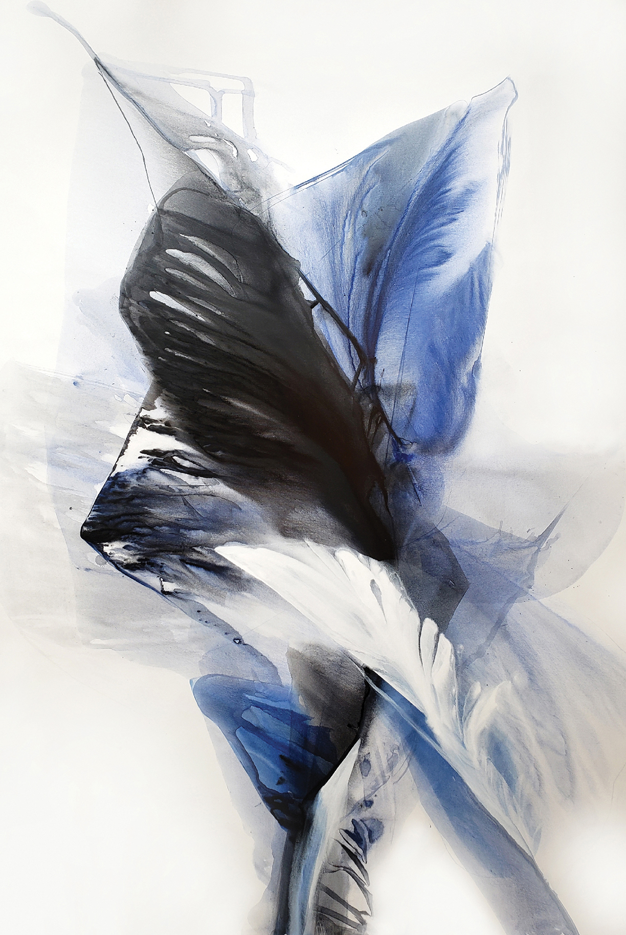
Lonliness
The artist accomplishes the “layering light” look by mixing her paints in her nine-inch plastic cups, where she then pours the colorful mixture on her canvas. Ridgeway explains that she manipulates the canvas by stretching it over stools and ladders, allowing the paint to create her signature style. “If you look at the work, you’ll see there’s motion in it and that’s achieved by the speed of the pour, the angle of the pour and that’s what makes it unique, no brush work,” says Ridgeway.
Fandango — Inspired by New Mexican flamenco dancer María Benítez. The twists and turns of the orange and red reminded Ridgeway of the dancer flowing and dancing the flamenco.
With over 30 years of experience as a commercial painter under her belt, Ridgeway has an endless portfolio of paintings, each with its own look. “Every single one of them is so different,” she explains. “Some are really bold and strong. Some are lighter and more transparent. Transparency is what makes the work different because when you pour a watered-down color over another watered-down color, you get a third color. You compose as you go.”
As an abstract artist, Ridgeway says, she pulls inspiration for her pieces from a memory, a feeling, or simply a color combination she envisioned or saw. “I don’t set out to paint something,” she says about when she approaches her canvas to paint. “I don’t set out to paint happiness or joy, or anything like that.”
Instead, Ridgeway takes what’s inside of her at the time and lets the colors and the pour shape the painting. This is one of the things that led Ridgeway to transition from figurative painting (painting an object or subject that is real) to abstract painting. “Abstract work is harder because it comes from inside you, you’re not looking at anything. You’re painting a thought, a feeling,” she says. “You’re painting a certain thing that’s come outside of you.”
Harvest Time — “When I started out, I wanted to use earth tones — amber and gold and a little bit of gray — more earthy than primary colors.” Ridgeway explains that when she threw the deep raspberry color and the white on the canvas, it reminded her of the rainforest. She squirted water in the center of the painting and let it drip. “A lot of people don’t know rainforests, but it’s like a soft, misty rain the whole time, so moist,” Ridgeway says. “Fruit everywhere, flowers everywhere, so you get that feeling of Mother Earth, just so abundant and rich and lifegiving.”
When a dear friend of Ridgeway’s passed away in 1999, the feeling that came out of her was sadness. To cope, she took this feeling and created a masterpiece. “I did this gigantic piece with only red and black, on a white canvas and I named it, Mi Corazón Roto, which means ‘my broken heart.’ And it looked like that, to me — an abstract broken heart.” It hung in her studio for a long time, until a best friend and collector of hers lost her husband. Ridgeway gifted the painting to her “and she hung it in her living room and it was like her broken heart,” she says. Ridgeway got the painting back after her friend passed away, saving it from being sold in a consignment shop. “So each piece kind of has a life of its own,” she says, going on to share that the piece recently found a new wall to call home.
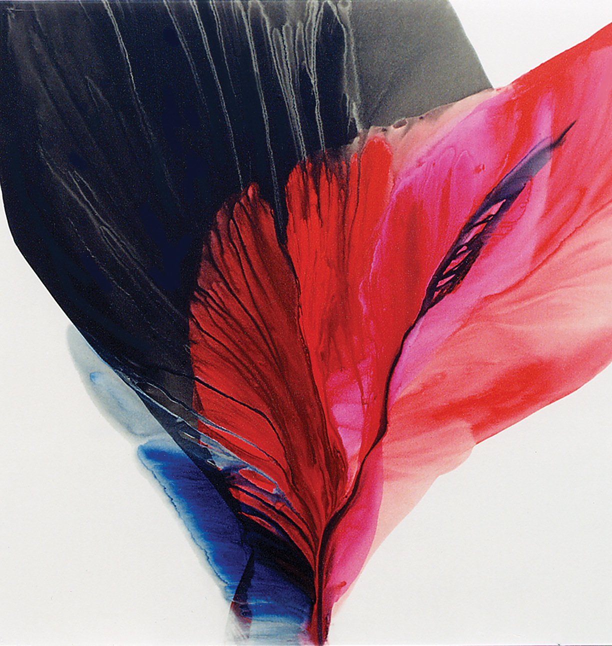
Mi Corazón Roto
One of the best parts of what Ridgeway does is when people get to see her paintings. “The viewer is actually the one that completes [the painting] because they see what they see and it might not have anything to do with what I did,” she says. “It’s so much fun to hear what people see. It’s never what I see.”
A Day in the Surf — “You know, with this COVID, we’re not able to travel, at least I’m not, and so I’m missing going to a beach this summer, I’m missing the water,” Ridgeway explains about this piece. Inspired by the water, Ridgeway created this piece that is reminiscent of the beautiful ebb and flow of the waves on a beach.
In a way, Ridgeway has come full circle in her career. In the mid 1970s, the artist visited a big gallery in New York to see the work of abstract artist Paul Jenkins, who used the same method of pouring in his work. “The paintings were enormous and they were in primary colors — red, blue, green, orange, yellow, a lot of black — and it just brought me to my knees,” Ridgeway says. “I had never seen anything like it and it was so powerful, and this entire gallery, with huge walls, was filled with this magnificent work, that I just stood there and cried. It was so beautiful.”
It is Jenkins, according to Ridgeway, that led her down the path to finding her creative voice. “I owe so much to my friend Paul who became a mentor over the years,” she says. “He passed away in 2012 and was a master, his work is in all the major museums in the world.”
Although Ridgeway has accomplished so much during her career and continues to show in galleries and paint commissions, she acknowledges she still has room for growth, “I’m learning every day. I don’t have all the answers,” she says. “And that’s the beauty of this work, it’s so different and every single day I learn something new. And that’s what’s exciting…. I’m just having the time of my life.”
For more information on Bette Ridgeway, upcoming showings, and paintings, go to RidgewayStudio.com or BetteRidgeway.com
Photos of artwork and Bette Ridgeway courtesy of Bette Ridgeway.
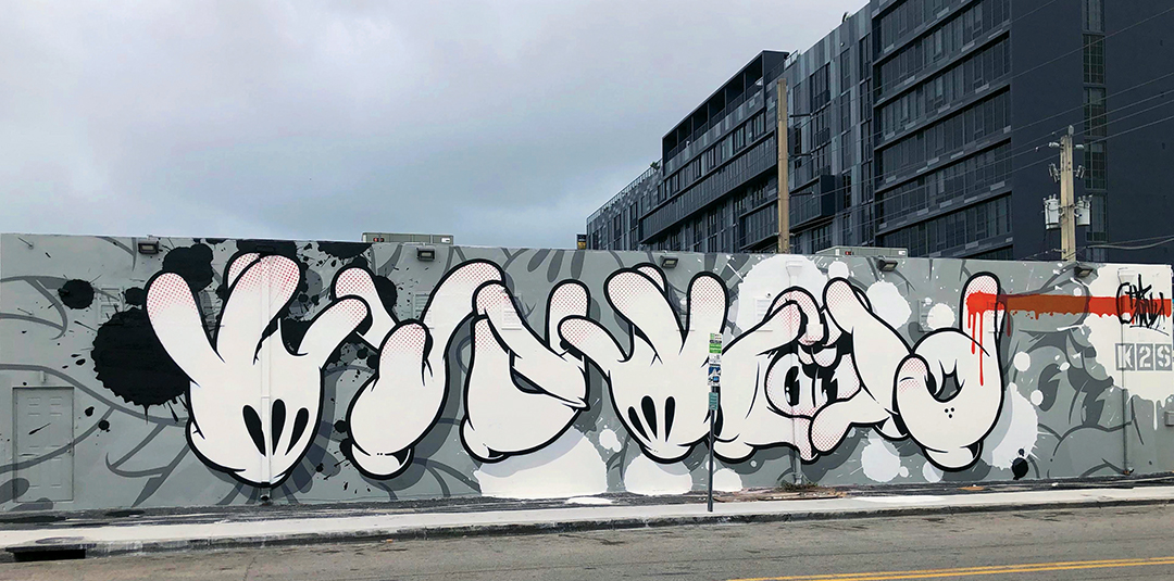
Slick, a native of Hawaii, painted this mural on the exterior of the Museum of Graffiti in Miami.
Photo courtesy Museum of Grafitti.
Its earliest practitioners were considered criminals, but now the work of some graffiti artists hangs in the nation’s most prestigious museums.
After society’s initial outrage over acts of vandalism in the name of creativity, art enthusiasts begrudgingly acknowledged that some wayward, urban painters were genuinely gifted. Over time, graffiti and street art earned a place in prestigious collections, private galleries and museums like the Museum of
Contemporary Art (MOCA) in Los Angeles and Whitney Museum of American Art in New York.
While graffiti is often viewed as an American-born genre, Michael Rooks, a curator of modern and contemporary art at Atlanta’s High Museum of Art, provides some historical context. “Graffiti and street art have their origins in the history of 20th century art — from Dada wherein text replaced image to inveigh against WWI on the streets of Zürich, to the Mexican muralist movement’s large-scale murals in post-revolution Mexico City, to Les Affichistes artists whose affiches lacérées (layers of torn posters and advertisements) were literally sourced from the streets and walls of post-WWII Paris.”
The evolution of American street art has been well documented in L.A. and New York, but the acceptance of this form of artistic expression has also occurred in Philadelphia, Miami, Chicago, and San Francisco.
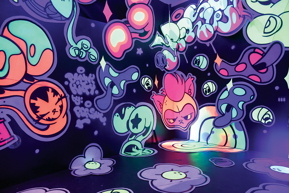
“Bunny Kitty’s Dreamstate Room” is a vibrant, playful work from artist Persue.
Photo courtesy Museum of Graffiti.
Some street artists are commissioned as muralists, a transition that monetizes and legitimizes their work, before eventually being discovered by curators. Ultimately, gallery representation leads to their art appearing in chic restaurants, hotels and private collections. Artists like Keith Haring, Jean-Michel Basquiat and Shepard Fairey — all once confined to the fringes of the art world — became creative celebrities. In L.A., the exclusive fashion boutique of Elyse Walker features artwork by RETNA, one of the most prominent local street artists, while superchef David Chang hangs the work of David Choe in Majordomo, his popular downtown restaurant. The city’s Mayfair Hotel features the work of a different street artist on every floor — resulting in diverse visual experiences for guests — and is a tribute to the depth of talent in the region.
The historic Mayfair, site of the first post-Academy Awards party in 1929, has been transformed into a trendy setting showcasing street art, curated by artist-in-residence Kelly “RISK” Graval. The Louisiana-born artist became one of L.A.’s most influential graffiti stylists and was among the pioneering artists to transition from the street to the gallery, as well as entering the worlds of fashion design and music video.
RISK’s own work is represented by a Buddha-inspired installation on the second floor and one of his murals will eventually soar above the 15th-floor pool deck. “I selected my “Metallic Tissue” series, which consists of a body of work that I paint on panels built out of repurposed spray cans,” reports RISK, who states, “They’re my imprint on society as an artist, my DNA.” He also installed some of his unique neon work in the lobby, which suits the vintage of the building. Overall, nearly 100 pieces throughout the hotel represent the diversity of L.A.-based graffiti artists and muralists like DEFER, Billy Morrison and Shepard Fairey, whose breakout work was the Barack Obama “Hope” imagery from the 2008 presidential campaign.
“There was a time when graffiti artists were a small underground subculture,” explains RISK, but adds, “The powerfully dynamic art sparked a younger generation and it exploded.” He acknowledges that street art festivals and museum exhibits helped elevate the genre within the polite corridors of the art world, but that true recognition has been stubborn.

Neon work from RISK, the artist-in-residence at The Mayfair Hotel in L.A. Photo courtesy the Mayfair Hotel.
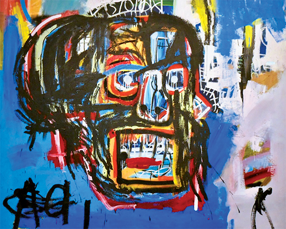
This untitled painting of artist Jean-Michel Basquiat sold for $110.5 million at auction. Photo courtesy Museum of Graffiti.
“It was time for a new generation to take over. The old guard and practices of art began to change,” insists RISK, who suggests progressive hoteliers are helping idiosyncratic artists to find an audience. “Hotel art was becoming stale, kind of like Muzak in elevators in the ’80s, and needed a new approach,” says the veteran artist. “Boutique hotels like The Mayfair are ahead of the curve and breathe fresh air into an exciting future for art, artists, and art enthusiasts,” says RISK.
Roger Gastman, an urban anthropologist and historian, is a leading authority on street art who counts The History of American Graffiti and Street World: Urban Art and Culture from Five Continents among his 50 books. Gastman remembers his own discovery of self-expression — through a spray paint can in the early 1990s — as a defining moment in his young life.
Gastman, whose first book, Free Agents: A History of Washington, D.C. Graffiti, documented the local culture he experienced in his youth, reports there is a distinction between graffiti and street art. “Graffiti is very name-based, very ego-driven, while street art is more image-based and involves additional tools and techniques,” says Gastman, but notes that both have their roots in vandalism. “Street art is a safer name and is more digestible to the public, but graffiti and street art are kissing cousins on the same playing field,” he muses.
“So much of this work is fantastic and deserves to be seen in a different light, collected and respected,” says Gastman, who laments, “A majority of galleries and museums still don’t accept this kind of art, look at it seriously or believe it should be shown.” Demographics, however, are driving attitudes, suggests Gastman. “People in their 30s and 40s grew up with graffiti, tattooing and skateboarding — it’s everywhere, in fashion, music and advertising — and it resonates with them.”
Last year, Gastman spearheaded the New York edition of Beyond the Streets, a massive 100,000-square-foot exhibition of prominent graffiti artists in Brooklyn, following a similar event in L.A. in 2018. “We basically built our own museum and 200,000 people walked through the doors,” he explains, adding, “It showcased graffiti and street artists, giving them respect and presenting their history in the proper light.”
Miami, whose Wynwood Arts District is defined by vibrant, multicultural murals, is a city with a strong tradition of street art, and its Museum of Graffiti pays homage to the approachable medium. Museum co-founder Allison Freidin explains, “Our goal is to celebrate a group of artists previously marginalized because of the stigma associated with graffiti,” and reports the Miami institution is the only one in the world exclusively dedicated to graffiti art. “Previously, there was no place to learn about these artists,” she adds.
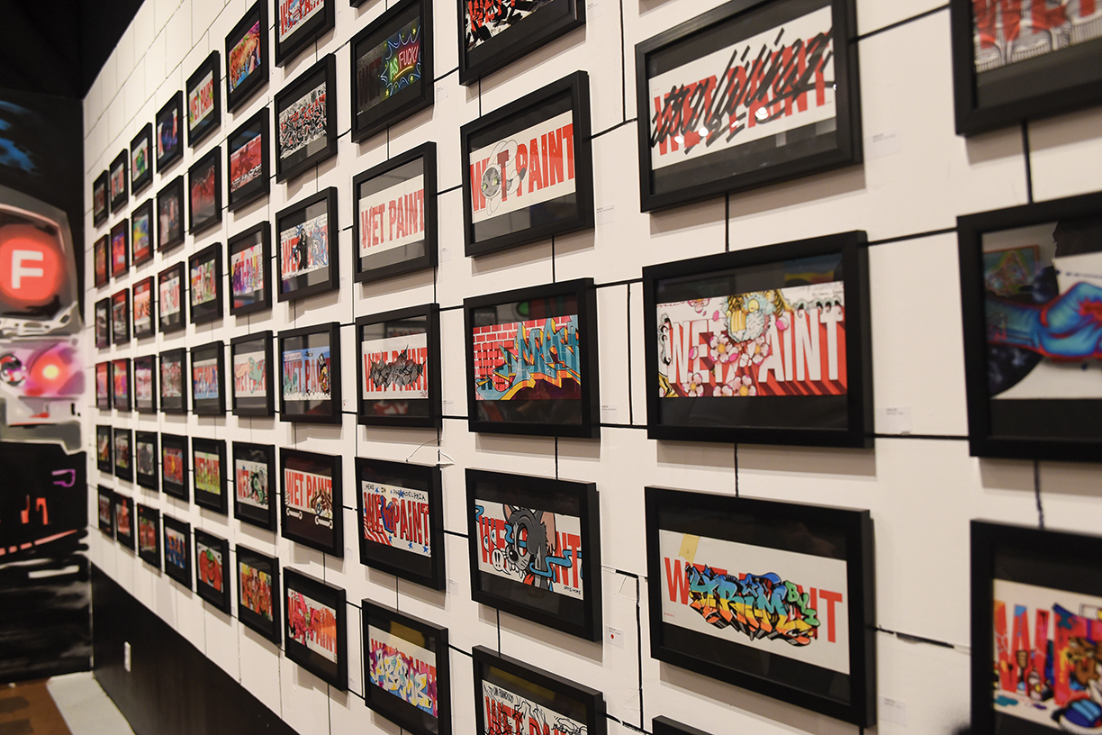
Above: The “Wet Paint” exhibit at the Museum of Graffiti in Miami, from artist Persue. Photo courtesy Museum of Graffiti.
At Right: “Party Felix” by Seen, one of many artists showcased at L.A.’s Mayfair Hotel. Photo courtesy the Mayfair Hotel.
Explaining its location in a former shoe warehouse in Wynwood, Freidin reports, “The district’s relevance in the past 10 years is a product of the graffiti art that transformed a sleepy industrial neighborhood into the world-class arts destination it has become,” noting the windowless warehouses made ideal canvases for street artists. The Museum of Graffiti’s own building is entirely wrapped in 14 different murals by acclaimed local and international artists like Shoe, EZO and Abstrk.
The museum’s interior galleries feature rotating exhibits such as a recent compelling vignette from artist Persue, who famously removed the “Wet Paint” signs that New York City transit workers used to tape to subway cars after painting over graffiti art. Persue sent more than 70 of those very placards to artists around the world to use as canvases, all of which were incorporated into an exhibit whose physical design resembled a New York subway station platform.
Freidin explains that Miami’s graffiti art movement began in the early 1980s when some youth who got into trouble in New York were sent to South Florida to live with grandmothers or aunts. Insisting there is no way to repress the energies of an artist, Freidin reports, “The art erupted like a vengeance.”
The museum co-founder applauds the success of local graffiti artists like José Parlá, whose work moved from the streets of Miami to a mural inside Manhattan’s One World Trade Center, as well as multiple museum exhibitions and commissions in Tokyo, London and Havana. “He was immensely talented and continued to put in the work despite the stigma associated with graffiti art as vandalism,” says Freidin, who adds, “He’s probably one of the biggest names in contemporary art in the world.”
It was not easy for some museum curators to persuade their boards of directors that people previously labeled as vandals should be showcased in world-class fine arts facilities, but Freidin maintains society has evolved. She offers the former criminalization of marijuana as an analogy, citing its progression from disdain to broad acceptance. “It takes forward-thinking arts enthusiasts to take a risk,” and reports major corporations are hiring these artists as creative directors. “They recognize the power of this art,” says Freidin.
Robert Michael Provenzano, professionally known as CES, is a leading graffiti stylist whose signature aesthetic is now influencing the generation of artists currently emerging from the streets. His art, which began almost 40 years ago in his native Bronx, repeatedly got him into trouble as a young man, but after being flown to Munich to demonstrate his craft at a museum he realized there was a market for his skills. “My friends and I used to have to steal supplies, but now I’m a sponsored artist by a paint company in Barcelona,” says CES of how attitudes toward graffiti art have changed.
CES has since earned commissions from Nike and Palms Casino Resort in Las Vegas, in addition to collaborating on a mural adjacent to Miami’s Museum of Graffiti, where he was recently headlined. He finds it ironic that the artistic expression that was so strongly discouraged when he was a teenager is now a source of pride for his family. “I had no idea that if I stuck with it all those years, the whole world was gonna dig it,” reports CES.
The High Museum’s Michael Rooks notes, “The migration of some graf artists into the mainstream via museum collections and exhibitions underscores a familiarity with the language of the street that is widely recognized among urban audiences, as well as the influential role it has on global visual culture today.” He adds, “A fulcrum point in the migration from the street to the museum has to do with an artist’s knowledge and understanding of this legacy and ability to speak with urgency and artistry to contemporaneity.”
The ultimate measure of acceptance of art is the monetary value it commands in the marketplace. In 2017, an untitled work of Jean-Michel Basquiat, who began his career spray-painting walls in Lower Manhattan, sold for $110.5 million to a Japanese billionaire at auction, eclipsing his own personal record of $57.3 million.
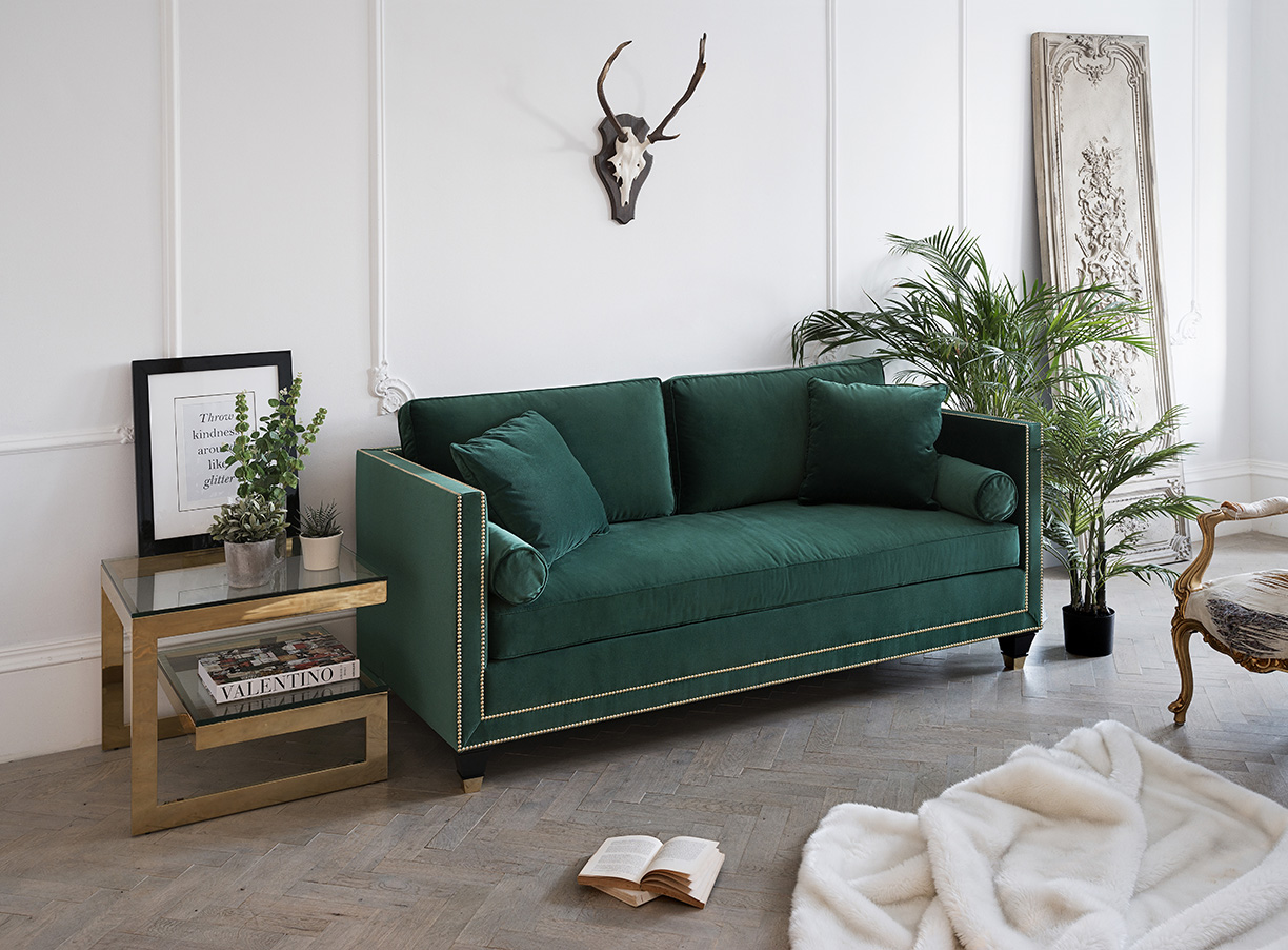
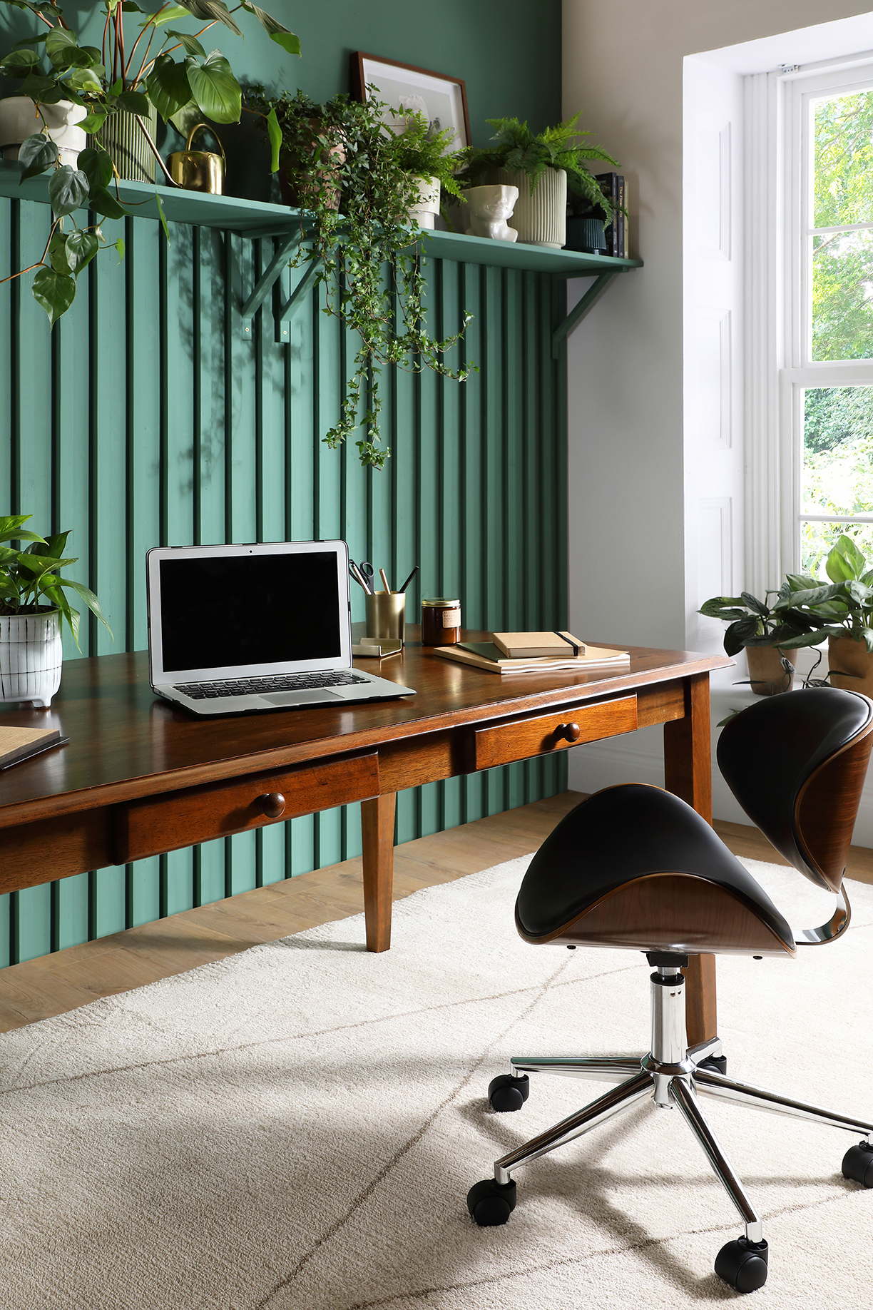
All photos courtesy Furniture Choice Ltd.
The color green symbolizes life, renewal, harmony and growth and is set to steal the limelight for the year ahead. With people getting busier and the increase of screen time for work, this calming color is a gentle nudge to unwind and rejuvenate.
Reminiscent of nature and the outdoors, using green in the home also serves as a reminder to be more eco-friendly and sustainable where possible.
Rebecca Snowden, Interior Style Advisor at Furniture Choice Ltd., shares 4 ways to bring this color into the home.
Use green as a feature wall color
Serene and soothing, green makes for a great feature wall color. From darker shades like emerald green to brighter hues like apple green, the color offers many psychological benefits. These include helping to induce relaxation and serenity, as well as giving off feelings of optimism and growth.
Because of its benefits, this color and its many shades can be applied to many different rooms.
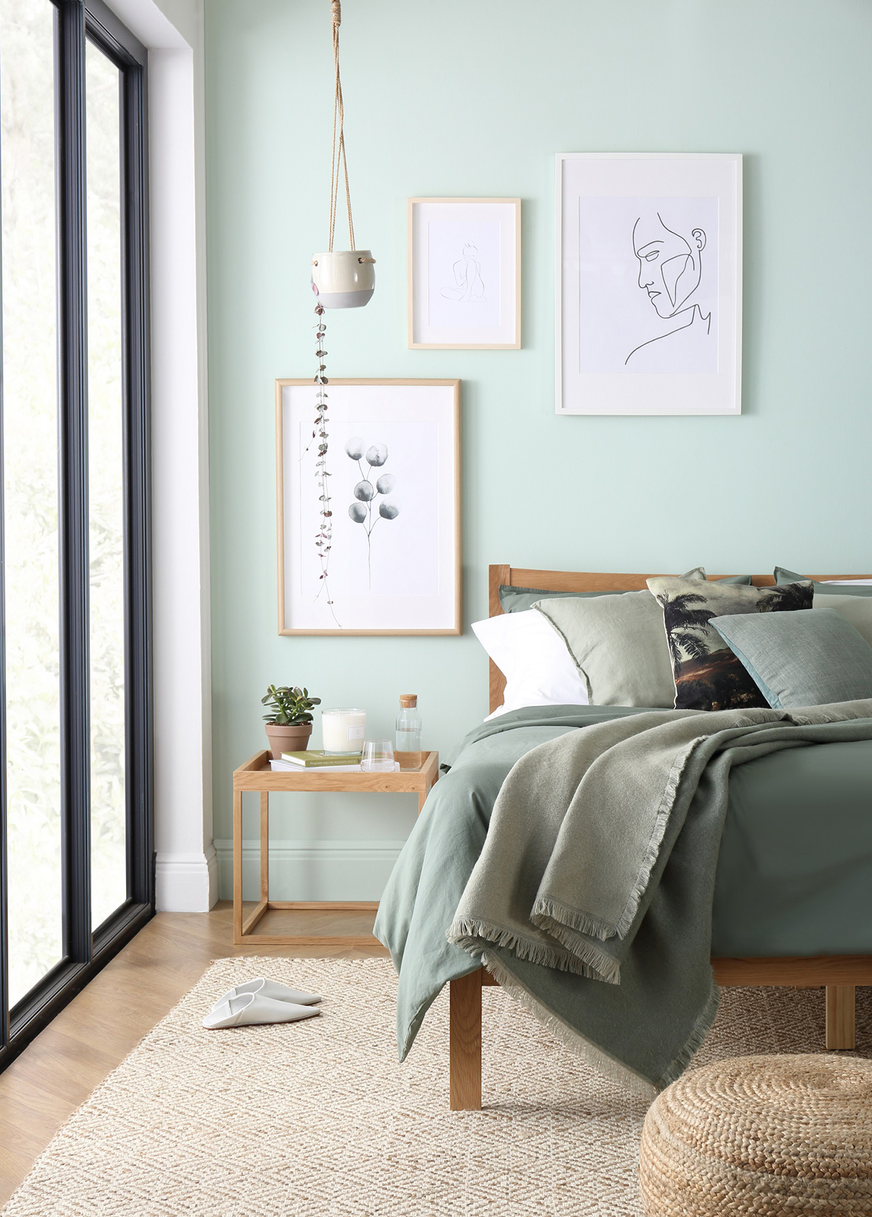
For example, home offices can benefit from a green feature wall as it helps soothe tired eyes. Similarly, sage green is a relaxing color that’s perfect for a bedroom feature wall, as it creates a calm and airy atmosphere that’s lighthearted and uplifting.
Some other accessories and textures to consider are jute, leafy plants and candles for relaxation. And where there are windows, choose sheer white curtains to allow sunlight in while maintaining some level of privacy. “The natural light will also cast a lovely glow on the sage green wall and give the color a little pop,” Snowden says.
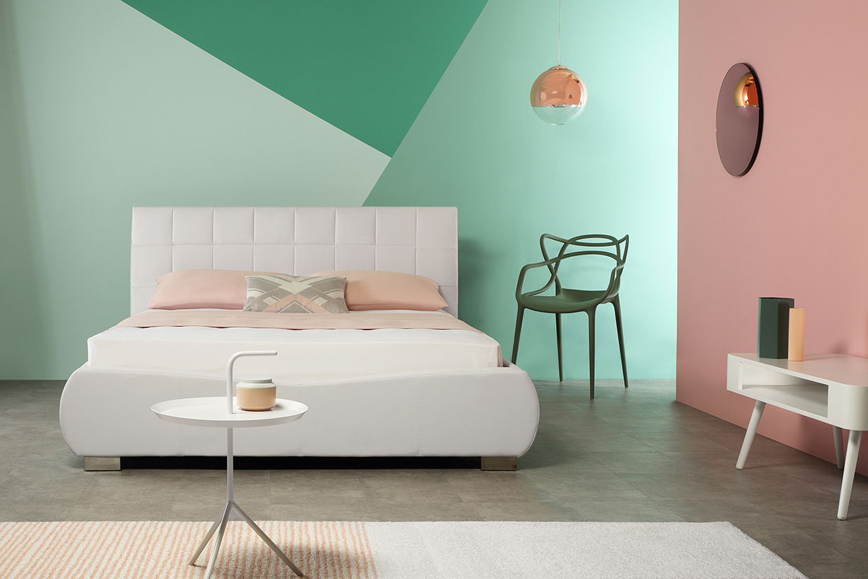
Pastels are the perfect lighter alternative
On the pastel front, neo mint is set to be very fashionable in 2020. “It’s young, fresh, energetic – great for pairing with an equally sunny color like coral,” says Snowden. “Brighten up a small space or designate separate functional areas by way of color blocked walls.”
Balance the boldness of neo mint walls with simple, neutral furniture like a white bed. Select furniture with slim legs and clean silhouettes to achieve a clean look. Alternatively, layer on rugs and cushions within the same palette for a maximalist approach.
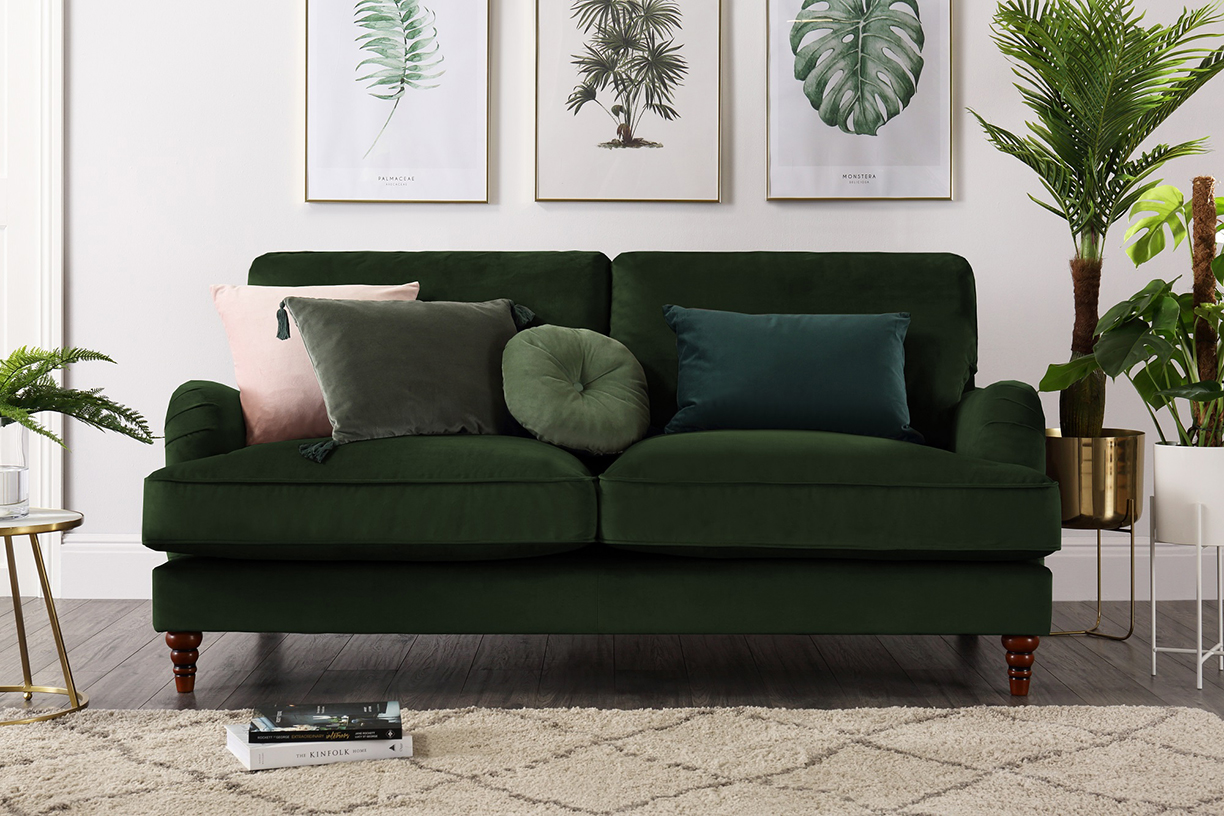
Statements pieces are key
Make a statement for the new year and invest in larger green pieces, such as an elegant green velvet sofa. The sumptuous material enhances the richness of an emerald green and adds depth to a space. To those anxious to make such a bold choice, Snowden notes that “a green velvet sofa is easier to pull off than you might think. It is incredibly chic and luxurious yet laid back enough to suit most interiors.”
Style with brass finished planters or side tables for a lavish look, or matching dark wood furniture for something classic and cosy. “Bold yet versatile, a green velvet sofa is easy to dress for the seasons and set to become a talking point of the home,” she says.
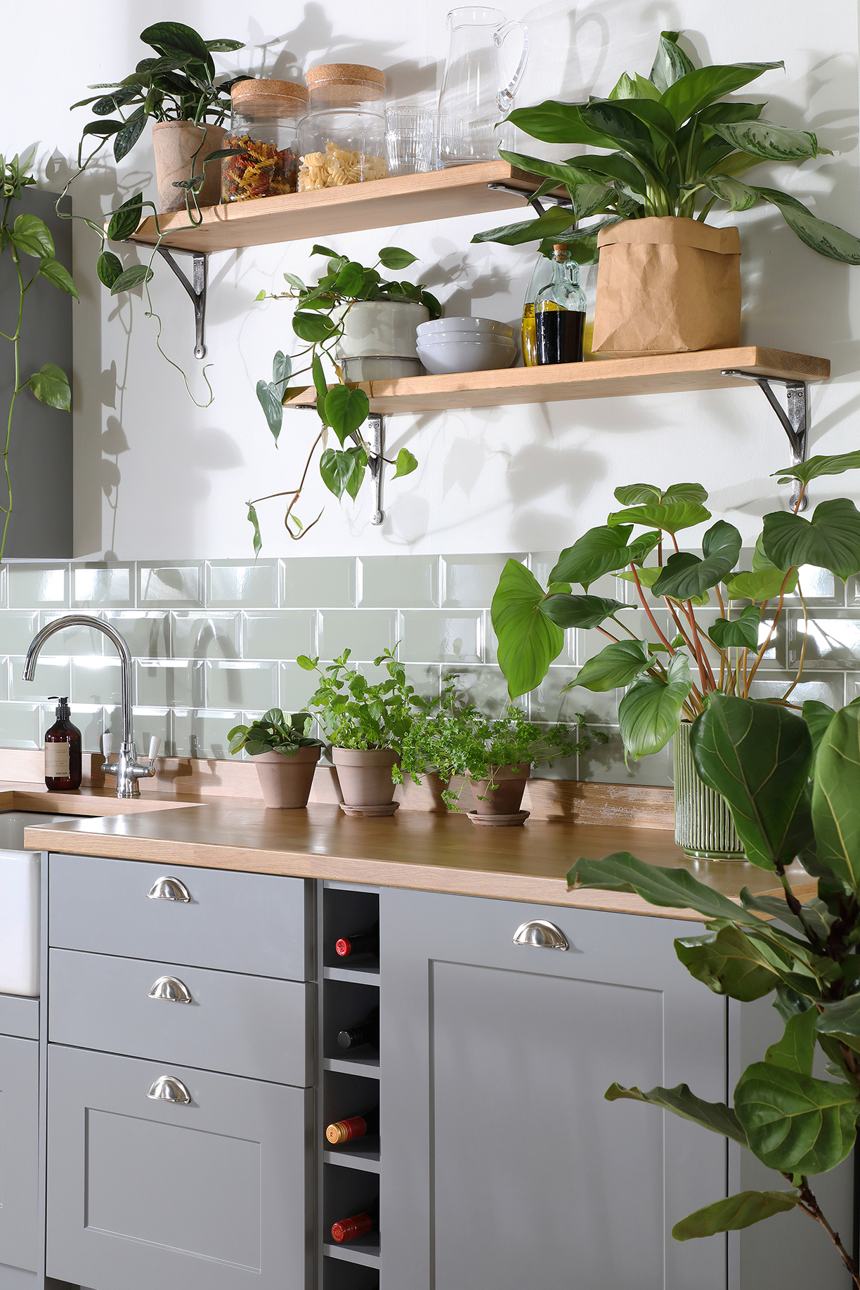
Houseplants are a designer’s best friend
Live green plants are the best accessories for decorating the home in shades of green. Some help clean the air and release more oxygen for easier breathing while others bear fruit for eating. Mix and match plants of different green shades for depth and interest in the home.
“Leafy, trailing plants inject a little wildness for an urban jungle feel while demure little succulents are adorable and easy to manage,” Snowden notes. “Plants are quick additions to the home that make a big impact on our wellbeing – a big focus for 2020.”
Cuba’s capital, Havana, is celebrating its 500th year anniversary in November this year, a legacy that has led to a delightful cultural atmosphere, one that has drifted into the design sector. The style of Havana decor is a wonderful, bright and fun, as well as easy to replicate with a few simple touches. Here are some key trends that easily bring Cuban decor into your home.
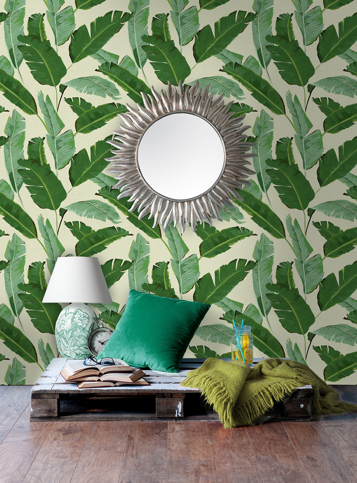
Cuban decor is nostalgic and charming — a trend that is likely here to stay. With a few easy touches, a room can be transformed into a bright and fun haven to enjoy a mojito in as if you were in Havana!

Photo by Alem Sánchez.
With literally millions of shades and hues to play with, color can also be intimidating. In a recent post by Northeast Meetings + Events, a series of experts give their professional advice on how to utilize color to enhance an entertainment venue and decoration. Fulfill the entertainer in yourself with their insight!
Expert advice varies on if there should be a color limit or if there’s a perfect strategy to picking colors. But when you do, internationally recognized color expert Leatrice Eiseman suggests starting with one lead color. “Then build the other colors around it.” And always take into consideration the existing room’s colors and lighting. “Whatever the venue is you’ve got to take into consideration what is already there that is immovable. What could you do to draw attention away from or disguise a presence of color that really is interruptive?”
As Director of the Eiseman Center for Color Information and Training, and the executive director of the Pantone Color Institute, Eiseman definitely has the know-how on color. She says that early in her career people outside of fashion didn’t pay much attention to color. “When I started out I’d often meet with a bunch of engineers sitting there with crossed arms,” she says. “But people have realized the psychological impact color has. … Color is a very important aspect of any work you do across design industries.”
When using color in decor, for events or otherwise, consider the mood you want to establish.
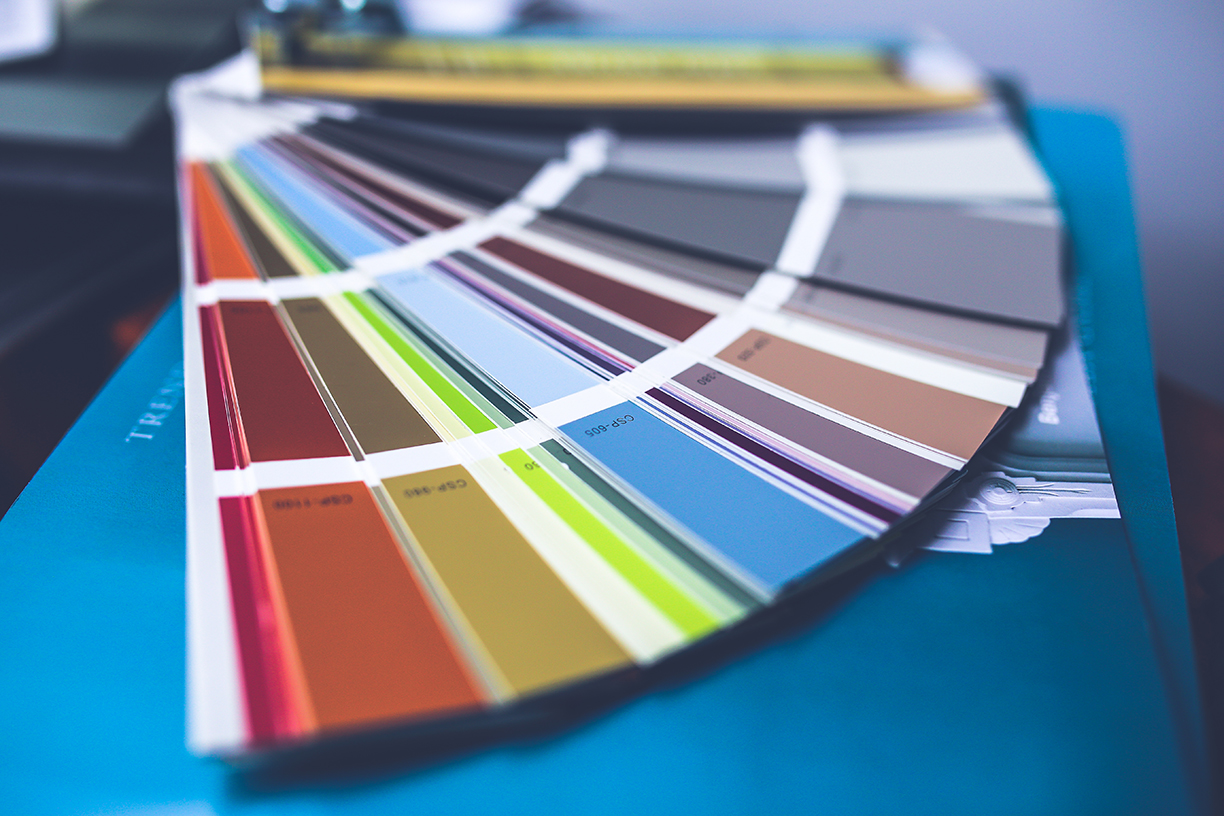
Photo by Kaboompics.com
“The use of cool colors and hues such as blues can help calm and relax individuals and generate clearer and a more relaxed mind-set, great for business sessions,” says Sarah Kelly, senior event producer with Cantrav Services. She often incorporates color to set a mood. “While the use of warmer colors and hues such as ambers and reds can help stimulate and generate a more active and warm response, great for team-building or brainstorming sessions,” she adds.
Photo by Pixabay.
Photo by Designecologist.
You can even use color to play off of factors such as the season of the event, suggests Dwayne Thomas, owner of Portland lighting company Greenlight Creative.
“There are some perennial things. If I do a fundraiser in the fall, there’s a 50-50 chance it’s going [to show] fall colors. In winter, blues tend to be more popular, and in the summer, reds are more popular.”
“Color adds an additional depth and sparks interest,” says Kelly, who suggests that planners be bold and purposeful — but not too bold. “There are two mistakes people can make, either using too much color and overwhelming guests’ senses or being afraid to use it at all and not fully committing to the event’s theme or identity,” she says. “But, as long as you stick to some basic rules such as making sure you use colors that complement one another … there’s no reason to go wrong.”
For more color tips, visit Northeast Meetings + Events post!
Slanted ceilings have made their way outside of the attic, now in living, dining and bedrooms. Designing under these slopes can be tricky, but there are ways to get around it — and even use them to make the room more elegant and spacious. Here’s how:
1. Light and Airy
Whenever you’re tight on space, adding a coat of white paint to the ceilings and walls can make all the difference. Not only does it add a simple and natural tone, but it’s malleable to design the room to your style.
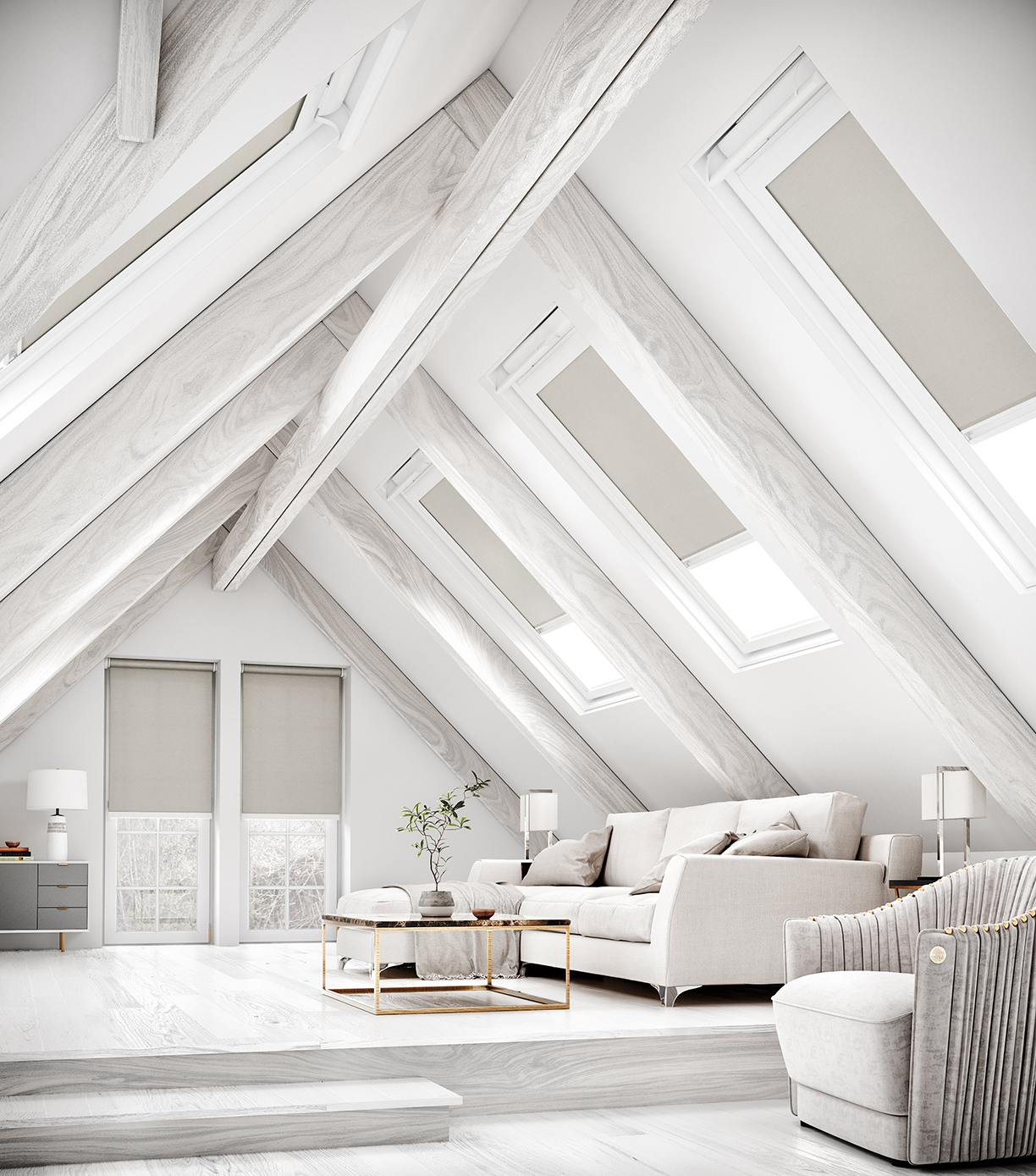
Photo courtesy of English Blinds
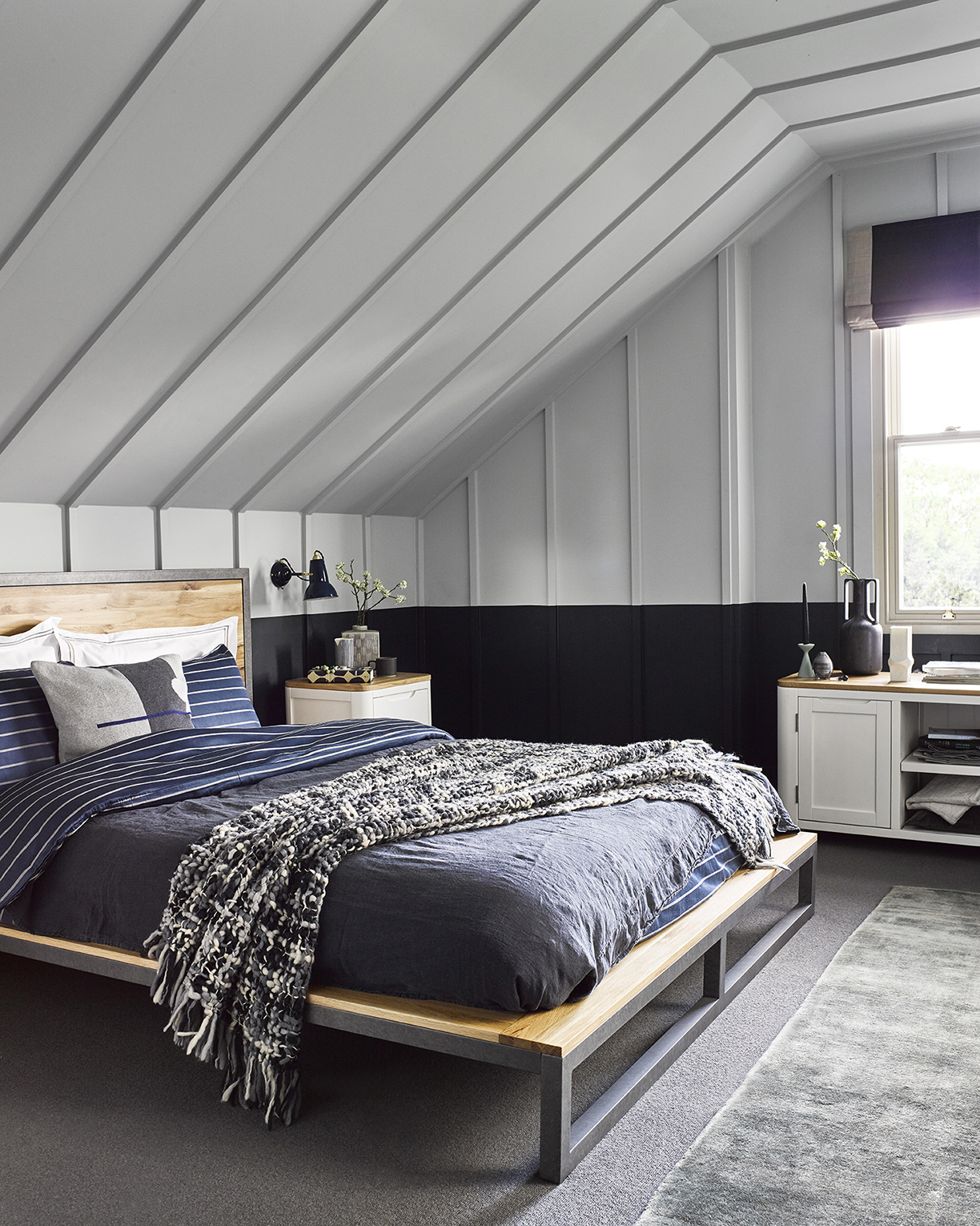
Photo courtesy of Oak Furnitureland
The blank canvas that comes with white walls and ceilings allows for limitless creativity. Create a nautical look for a more relaxed vibe, or add bold colors to make the space stand out. With a white canvas, slanted ceilings can do no harm.
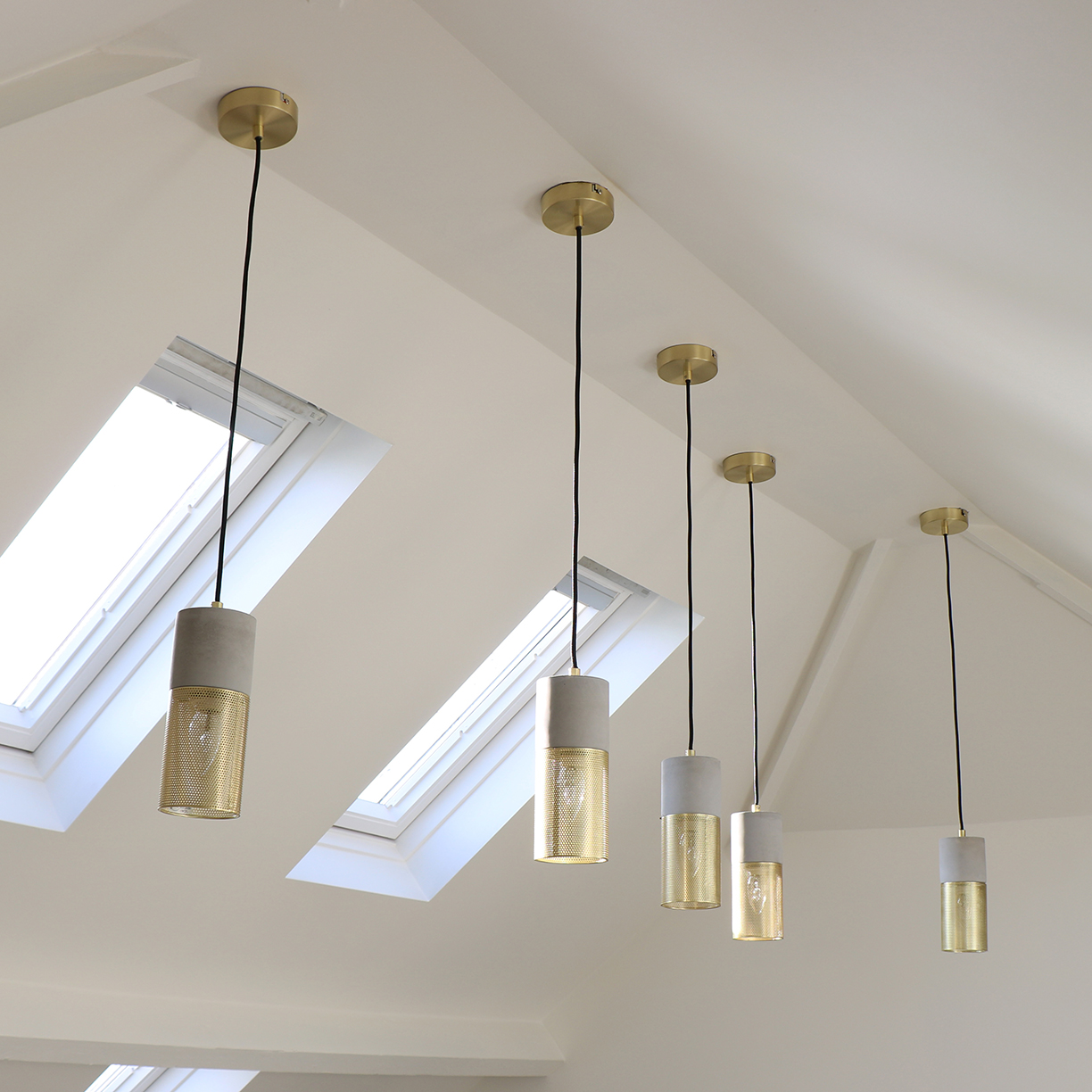
Photo courtesy of Melody Maison
2. Lighting the Room
Lighting a room can be the most difficult challenge when designing a space under slanted ceilings. Many don’t think they can use any overhead lighting, since the ceiling is on a slope. In reality, however, it isn’t impossible — it’s all a matter of picking the right light fixtures.
This is a simple yet elegant style for light fixtures that work perfectly on slanted ceilings. The wires can slightly slightly bend, so that they hang naturally.
Another great way to add natural light under slanted ceilings is with skylights. They flood the room with natural light in the daytime and add a unique and stylish look to the space.
3. A More Natural Look
Sometimes, however, it’s better to let the slanted ceilings add a unique design to the room, rather than hide them with an all-white hue. Adding wooden beams can do just the trick. When the ceilings aren’t too low, wooden beams won’t emphasize the height, but add a beautiful finish to the room instead. Light or dark browns for the wooden beams create a beautiful, natural look that goes with any style.
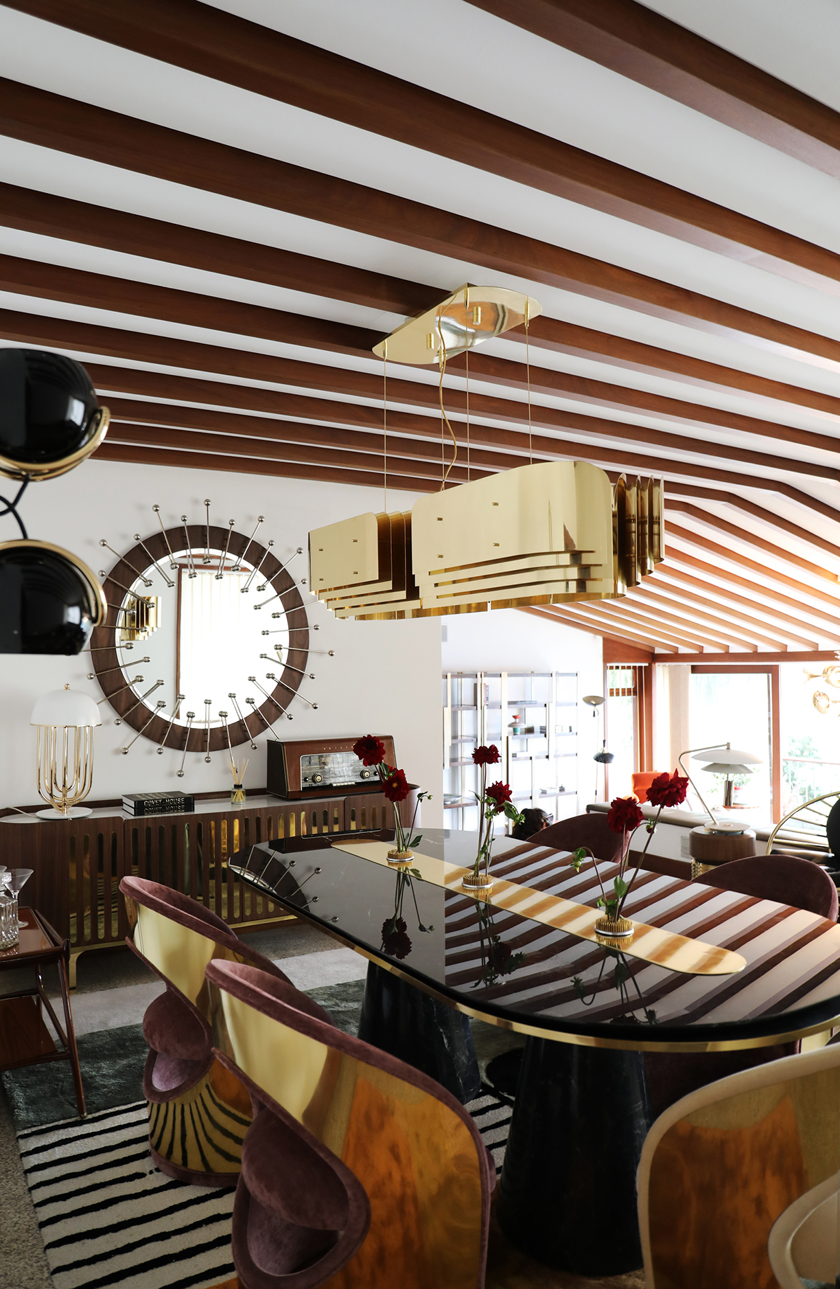
Photo courtesy of Covet Valley
Photo courtesy of Covet Valley
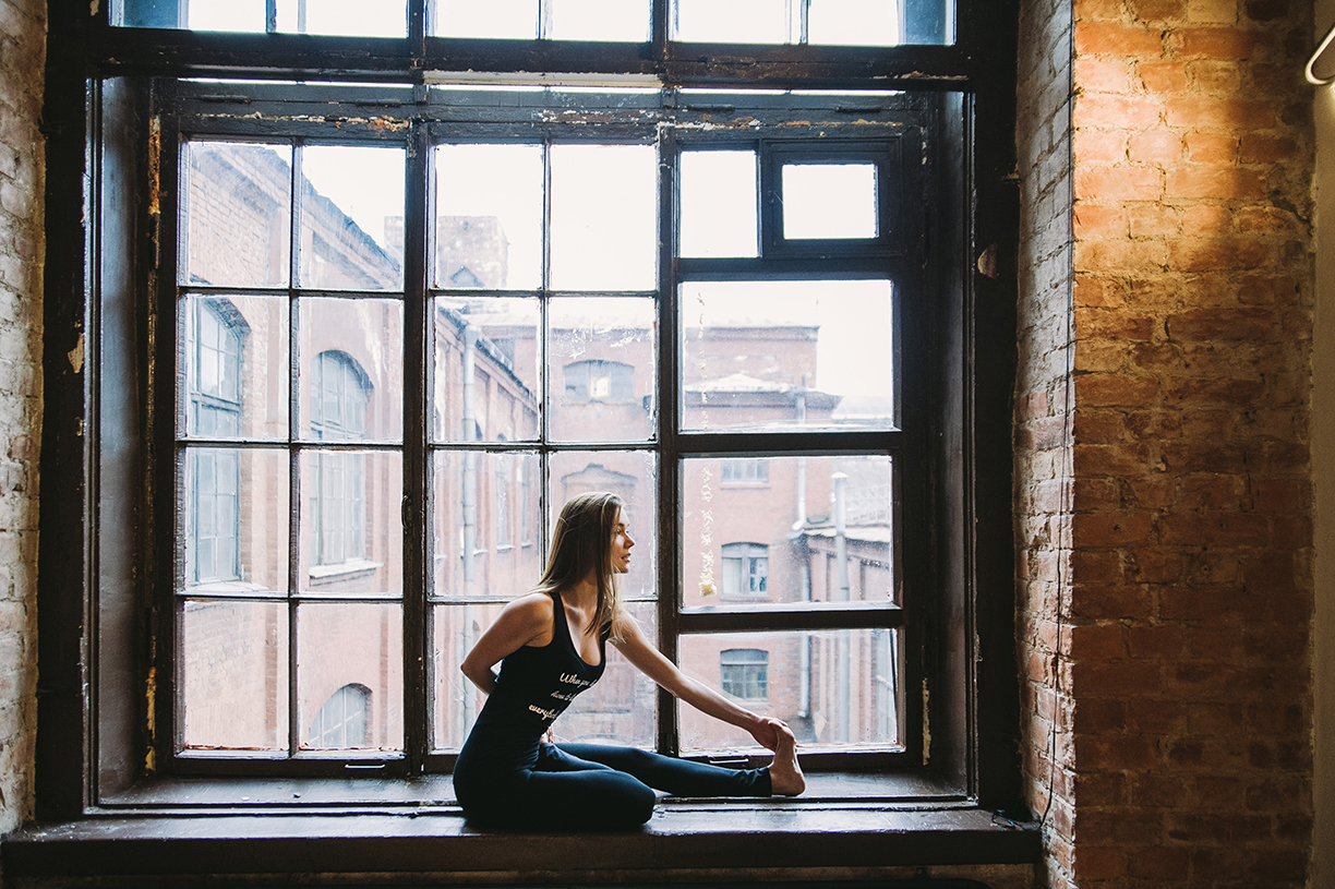
No matter the lifestyle, wellness and the pursuit to live better has been a rising trend in today’s world. In 2018, Pinterest reported that searches for “self care” were up 140 percent year-over-year, with no mention of stopping. Recently surveyed by national paint brand Sherwin-Williams, homeowners and professional interior designers have also noticed this uptick in wellness and how it affects modern home design and décor. Looking to make your spaces “healthier”? Check out these recent trends to see how you can incorporate wellness into your home styling.
Self-Caring for Your Space
People are taking self-care beyond their body and into interiors. According to the survey, nearly 42 percent of designers say they have been asked to incorporate self-care into their designs. Twenty-nine percent of homeowners also take self-care into consideration when decorating their home.
The most popular way to bring wellness into a space also happens to be one of the easiest — natural light. Eighty-seven percent of designers use natural light to effortlessly reflect wellness.
Photo by Daria Shevtsova
Breathe It In
Improving indoor air quality is key for homeowners and designers looking to make changes. Over 54 percent of homeowners cite air quality as away they bring wellness into their homes, and 58 percent of designers use it as a tool to incorporate wellness.
Limiting volatile organic compounds, or VOCs, that are released through building materials is one of the best ways to improve air quality. This is done by using lower-VOC paints and other home improvement products that are sustainably sourced and have a low-carbon footprint.
Photo by Anamul Rezwan.

Color
When it comes to color, designers and homeowners do not see eye to eye on their top color choice that represents or stimulates wellness. Nearly 41 percent of designers say that green associates the most with wellness, whereas 34 percent of homeowners believe this color to be blue. Another popular color is white/gray, which 11 percent of designers and 18 percent of homeowners associate with the trend.
The color least likely to be associated with wellness? Red. Not a single designer and only 1 percent of homeowners reported that they associate this hue with wellness.
Photo by Pixabay.
Total Zen
In regard to specific spaces that are designed to promote wellness, homeowners different on their choice of which space was the best to achieve “total zen.” The top choices included a gym/fitness room (41 percent), a reading room (41 percent), and a greenhouse (38 percent). These choices differed from designers, who say that the most popular wellness rooms they’ve been asked to design in the past year include a reading room, a sauna/spa, a gym/fitness room, or a meditation room.
No matter the space, these insights into the wellness trends of today may better help you to find the wellness you crave from the comfort of your own home.
Photo by KatjaFiona.
Whether it’s in the form of art displayed on the wall or accents situated on furniture, incorporating warm tones in your home will make it feel calm and cozy.
Warm tones typically consist of reds, oranges, yellows, browns, and tans. 2019 has been all about being in touch with nature, and these earthy tones keep that trend going. Whether you opt for deep forest browns and berry-red, or desert-inspired terracotta and sand, there are so many ways to make your house feel more like a home.
We are proving just how versatile warm tones can be. You can arrange diverse color palettes to create almost any atmosphere, from bright and lively, to tranquil and welcoming. Here are some looks to explore.
Photo courtesy of Modish Living
Rustic Style
Using nature-inspired textures and earthy colors, a rustic feel emphasizes natural beauty. Layer autumnal oranges, browns, reds and creams to create a rustic feel in your home.
A Bold Statement
Use bolder warm colors, such as bright yellows, oranges and reds, to create a bright and lively space. This Tumeric-colored soft bean bag ottoman forms the perfect bold centerpiece for a group of bean bag chairs.
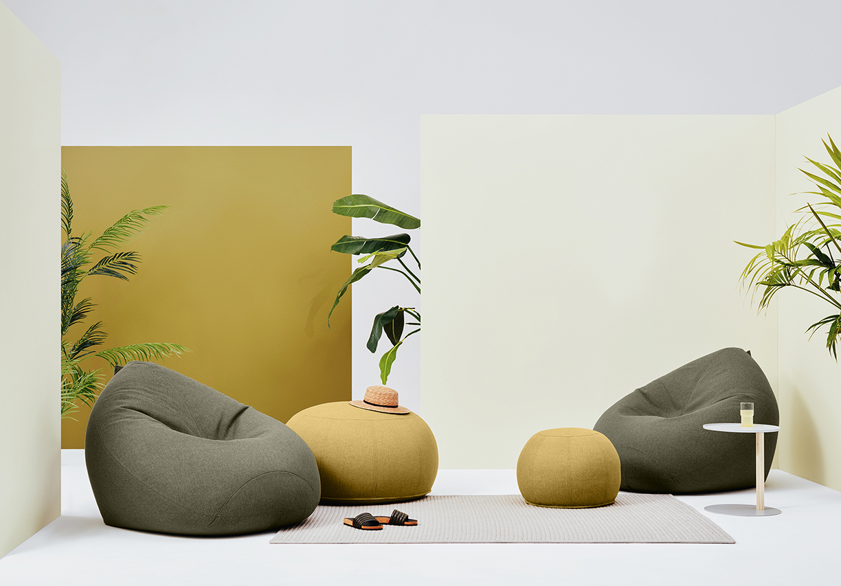
Photos courtesy of Lujo
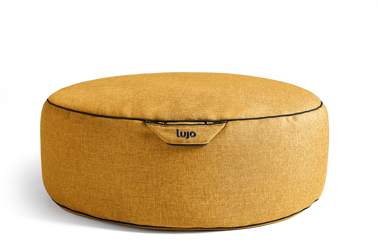
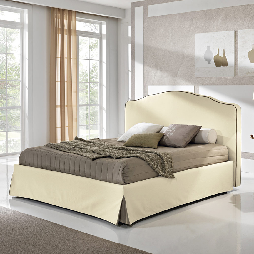
Photo courtesy of Viadurini Collezione Notte
A Mix of Warm & Cool
Add a single warm accessory to balance cool neutrals (whites and grays). For example, add a soft brown comforter with natural green accents to an all-white room to keep your space fresh, yet authentic.
Inspired by Nature
For a nature-inspired look, incorporate wood-inspired colors. “Wood furniture and surfaces support warm color palettes. To keep the look from going cabin, limit the use of actual wood and incorporate wood-inspired colors,” according to Better Homes & Gardens.
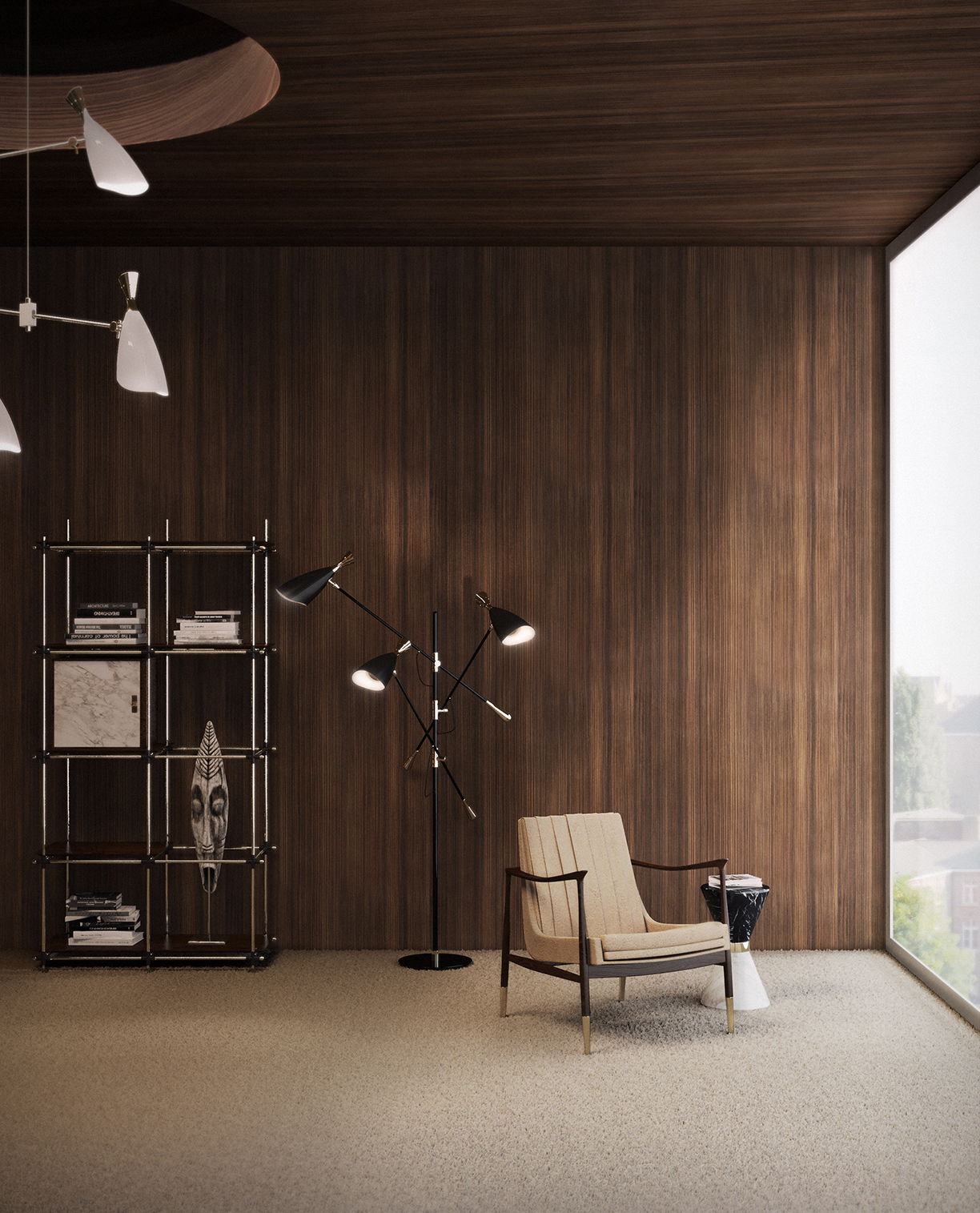
Photo courtesy of Essential Home
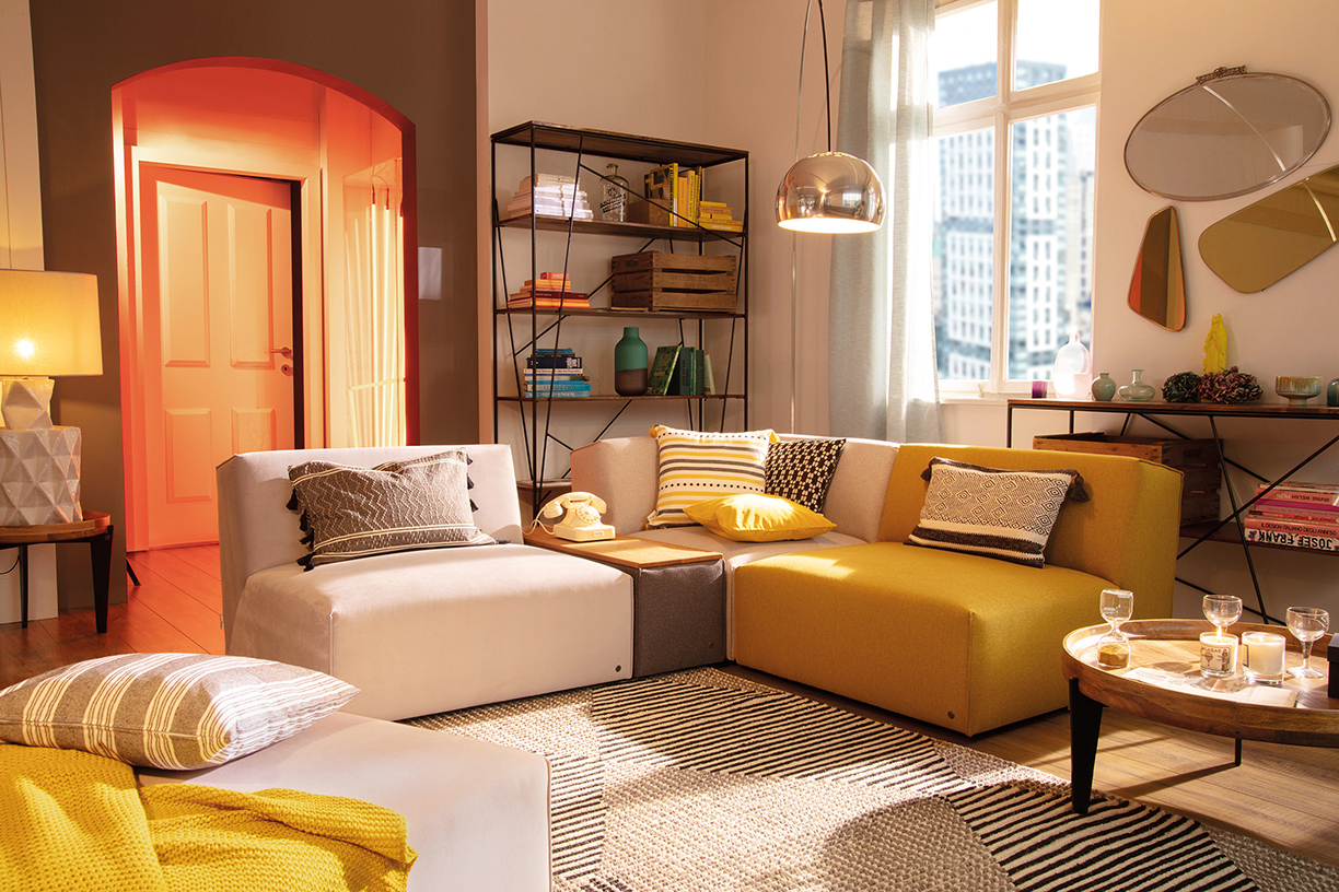
Photo courtesy of TOM TAILOR
Retro-Inspired
Warm tones can liven up any style, even a retro-inspired interior. Add a pop of bright orange or red to further your look.
As spring fast approaches, it’s time to rid your home of those dark winter tones — such as browns, blacks and grays — and time to bring in a few bright accents.
From neon yellows to pale pinks, here are a few colors you can use to brighten your home in time for spring.
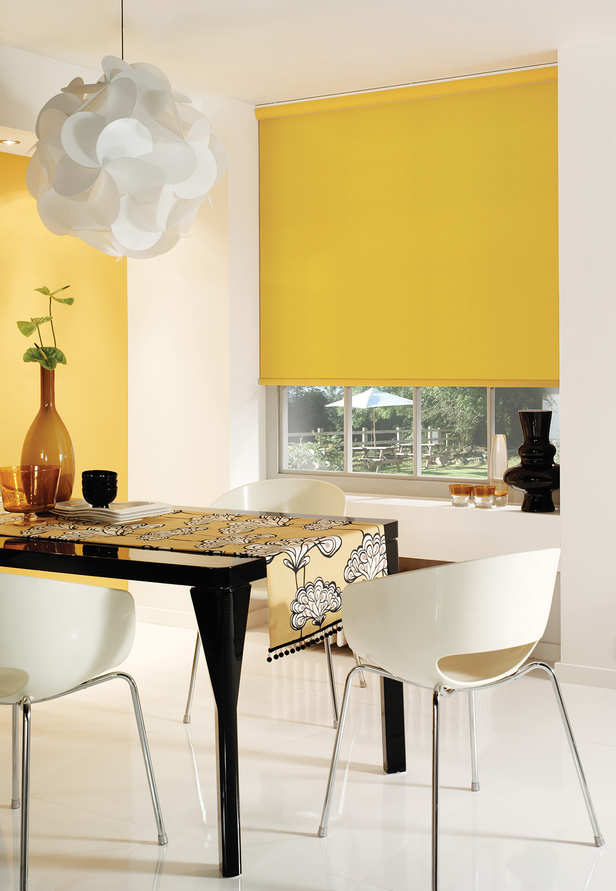
Yellow
Whether it’s the image of sprouting daffodils, the sandy beach or the shining sun, yellow is surely a color that reminds us all of springtime. From carpets and cushions to sofas and tables, these pieces will help you to embrace a pop of yellow just in time for spring.
Photos courtesy of English Blinds
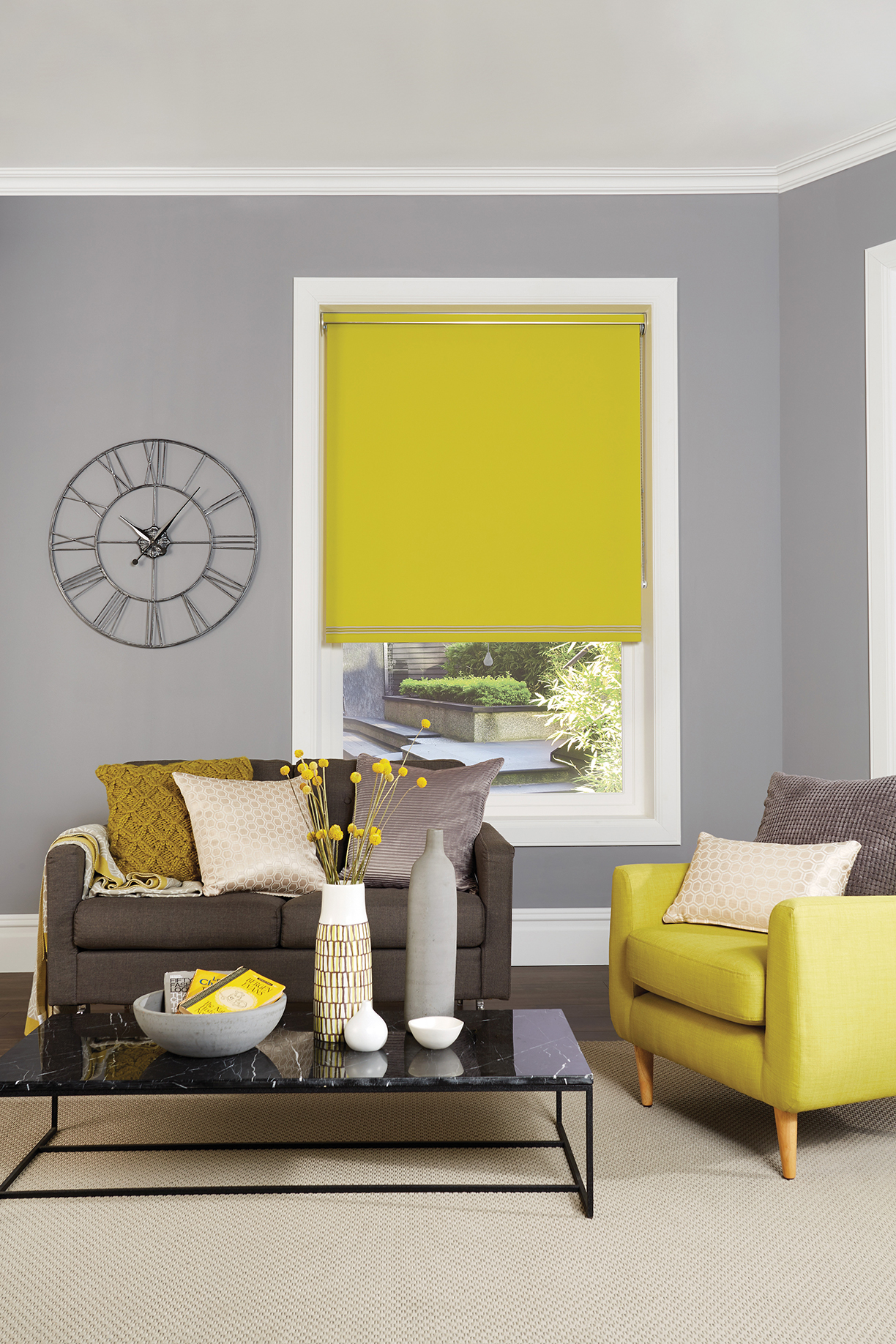
Blue
From bedrooms to living areas, both light and dark shades of blues create a calming atmosphere reminiscent of laying on the beach.
Photo courtesy of Covet House

Photo courtesy of Brabbu Design Forces
Woven by artisan weavers in Marrakech, this luxe bohemian home accessory is extremely versatile — use it as a blanket, decorative throw or statement wall hanging.
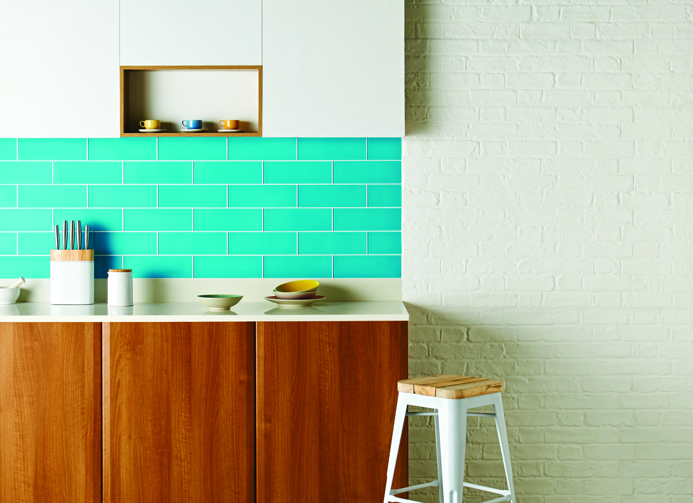
Teal
Teal, a color that has maintained popularity since 2017, pairs nicely with metallics, especially coppers and golds, or leafy prints. From kitchens to cushions, this bright and cheerful color can be used is almost any space.

Left: Photo courtesy of Bohemia Design Limited
Middle: Photo courtesy of Garden Trading
Right: Photo courtesy of AUDENZA
Pink
Spring is the perfect season to bring pink accents into your home, whether with wall decor, a new throw pillow or a vase of flowers.
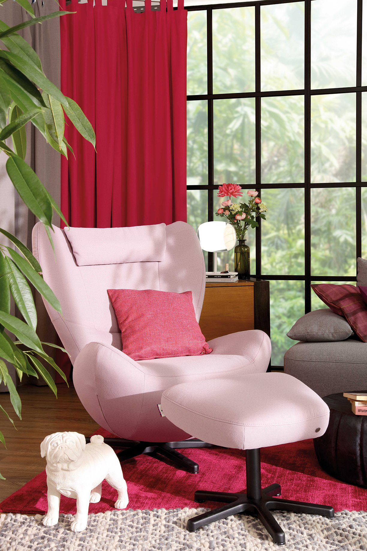

Enjoy Hollywood glamour at its best with this Marilyn velvet armchair in a soft pink cotton velvet. The curvaceous shape of this blush pink armchair offers a touch of chic to your space.
Left: Photo courtesy of TOM TAILOR | Above: Photo courtesy of AUDENZA
Green
The bright yet soothing shades of greens, which resemble the spring’s natural outdoors, can help to bring life into any space.
Right photo courtesy of
Sweetpea & Willow
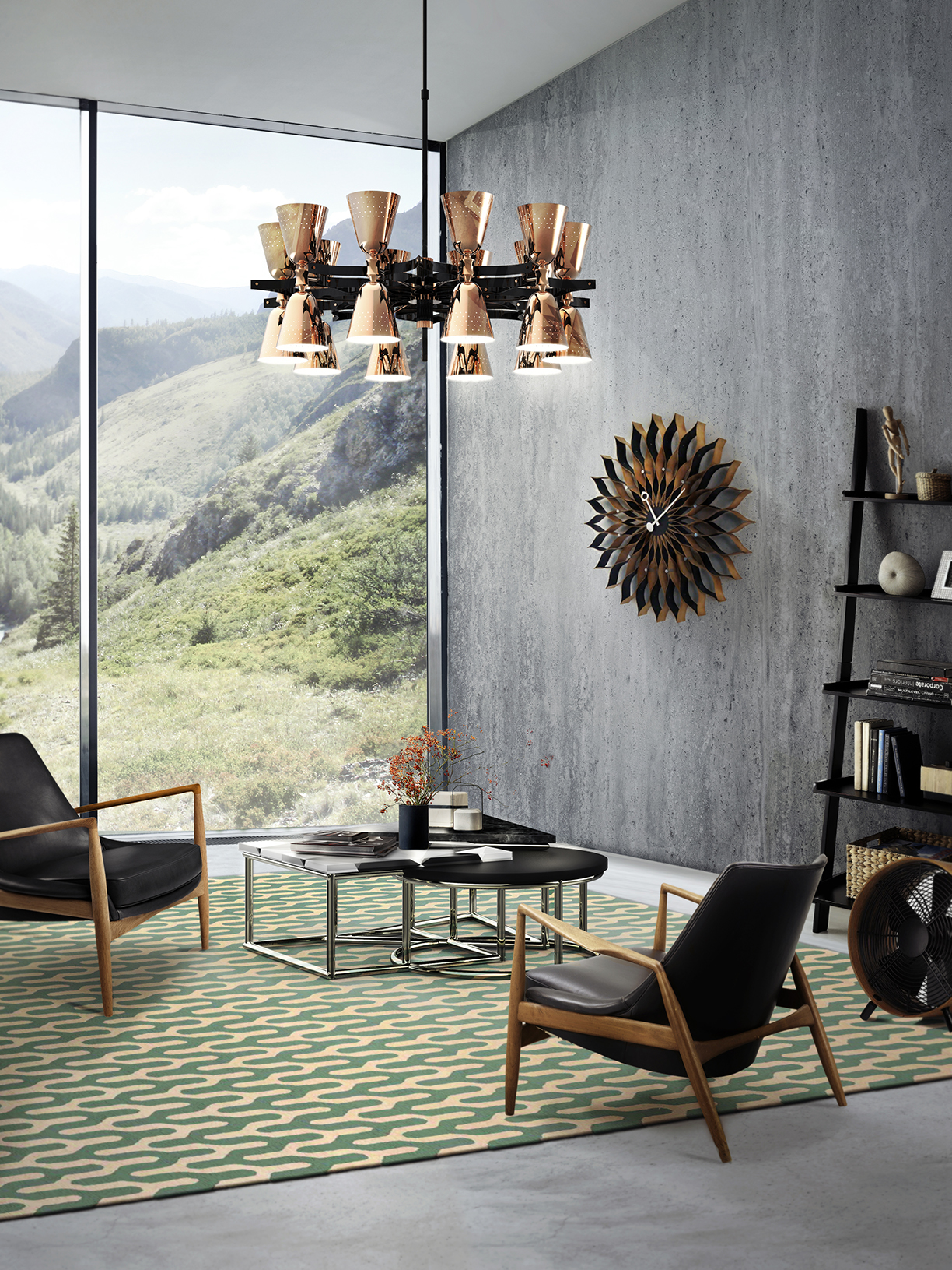
Photo courtesy of DelightFULL